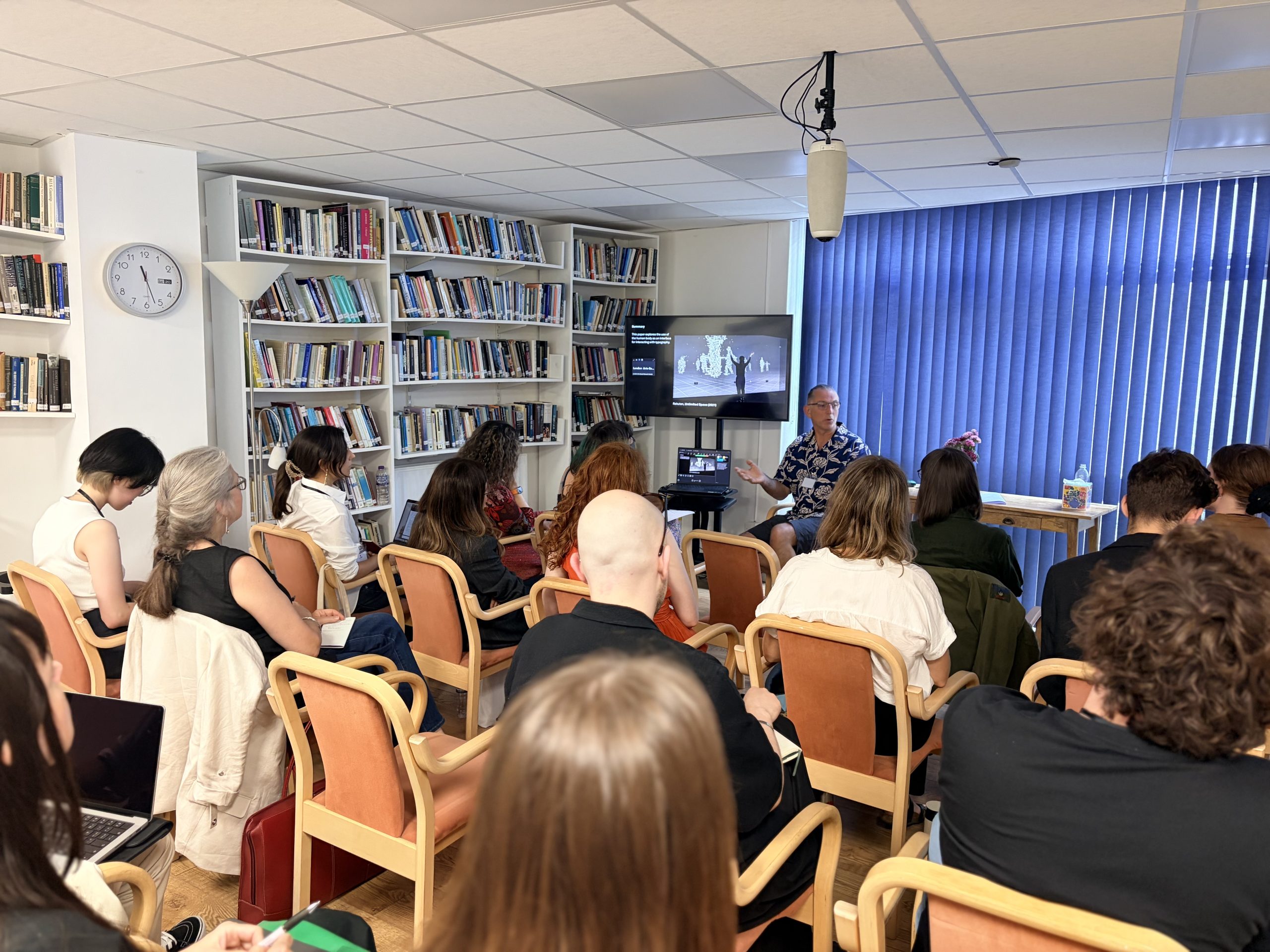
I recently presented a paper exploring embodied interaction with typography at ‘The Body and Embodiment in the Arts and Arts-based Research’ conference organised by the London Arts-based Research Centre (LABRC), Camden.
It was a great opportunity to comment on a number of influential works and reflect upon my own practice in this area. A diverse range of researchers and artists presented outcomes from a variety of disciplines with ’embodiment’ as a connecting theme. As the theme was widely interpreted, the work discussed ranged from land art to poetry to literary review to interactive VR experience and much more.
The diverse yet engaging nature of the conference, as well as the low key charm of the Camden town house setting, gave the event a creative community atmosphere with a certain level of intimacy and authenticity. Thank you LABRC.
My paper received generally positive feedback and elicited a number of interesting conversations and connections. You can check out my slides below.
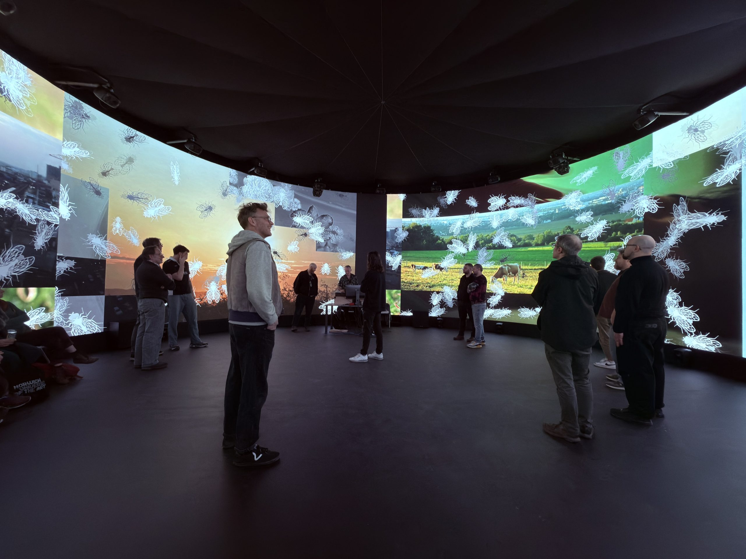
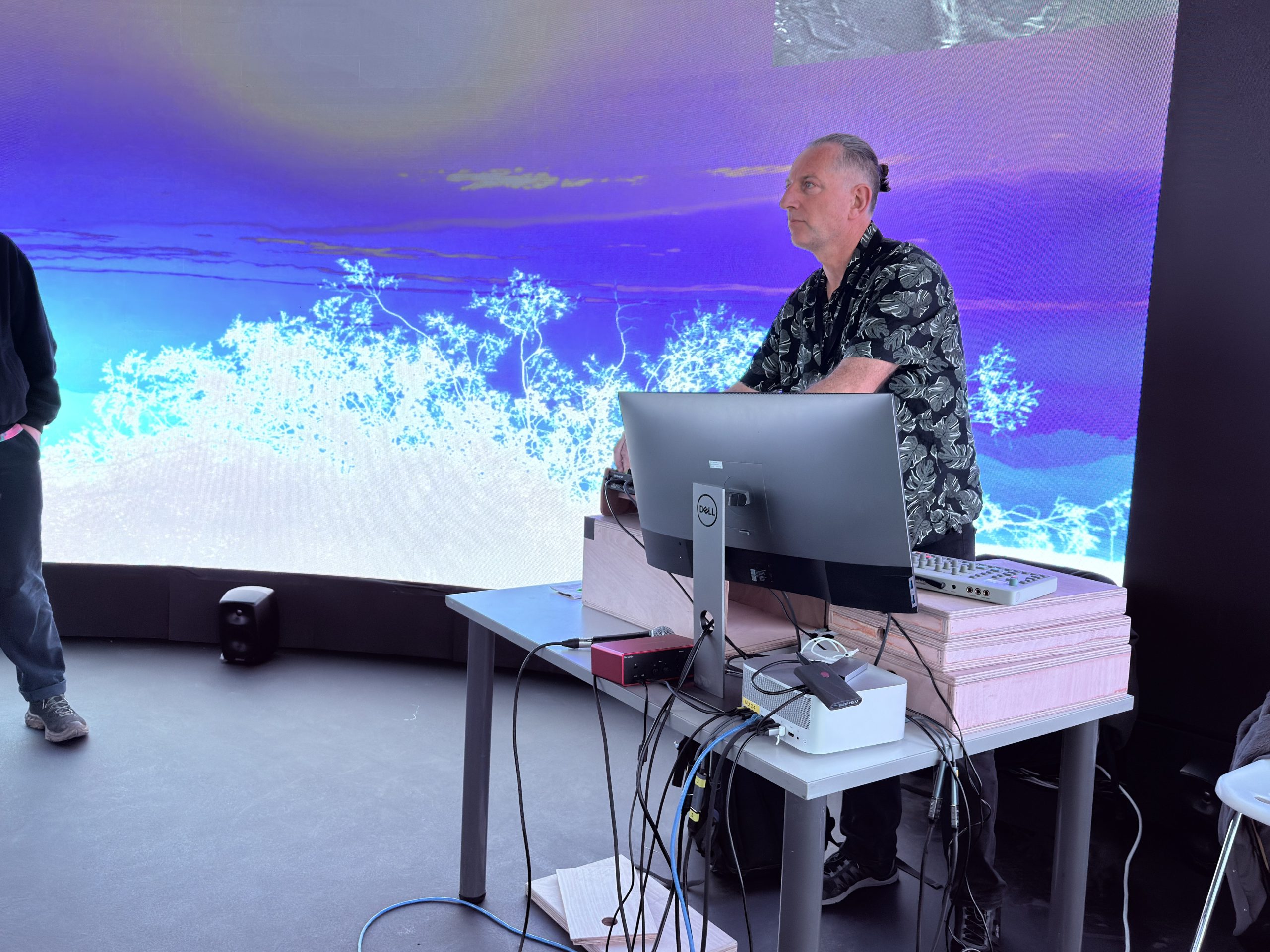
On March 18th 2026 I performed an audiovisual work which, although unnamed and effectively still work in progress, is the product of research and development over the previous 6 months or so. The performance took place within the 10-metre diameter, 4-metre high, circular LED screen at Norwich University of the Arts’ Immersive Visualisation and Simulation Lab, as part of the Collusion-led Art Tech Play programme.
Inspired by the classic quote from the Bhagavad Gita, Chapter 11, Verse 32, variously translated.
“I am Time, the mighty cause of world destruction, Who has come forth to annihilate the worlds.”
Translated by Winthrop Sergeant (1984)
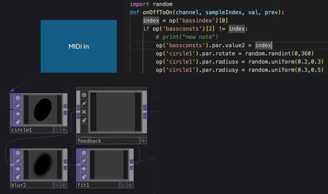
The work explores themes of destruction, natural resilience, and human responsibility (or lack of it) and uses TouchDesigner to create visual outcomes that respond in real time to performed electronic music, using both instrument MIDI data and audio data as inputs. Although I have been experimenting with audiovisual performance for some time, this work is somewhat new territory for me as the content is largely videographic.
It is easier than ever to collect libraries of videos, many offered free by individual videographers. Some are highly composed, others more naturalistic. Increased ownership of high quality video cameras and the proliferation of drones are both leading to greater numbers of ‘citizen videographers’ producing compelling video content, for example https://www.pexels.com/.
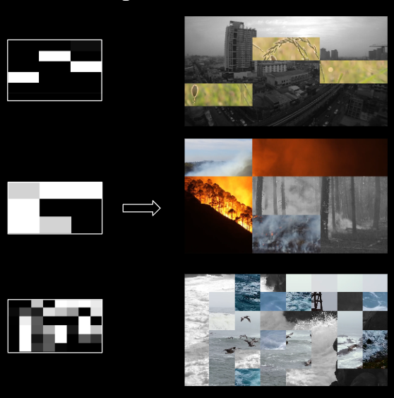
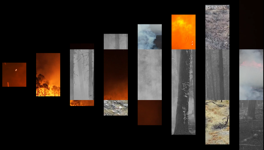
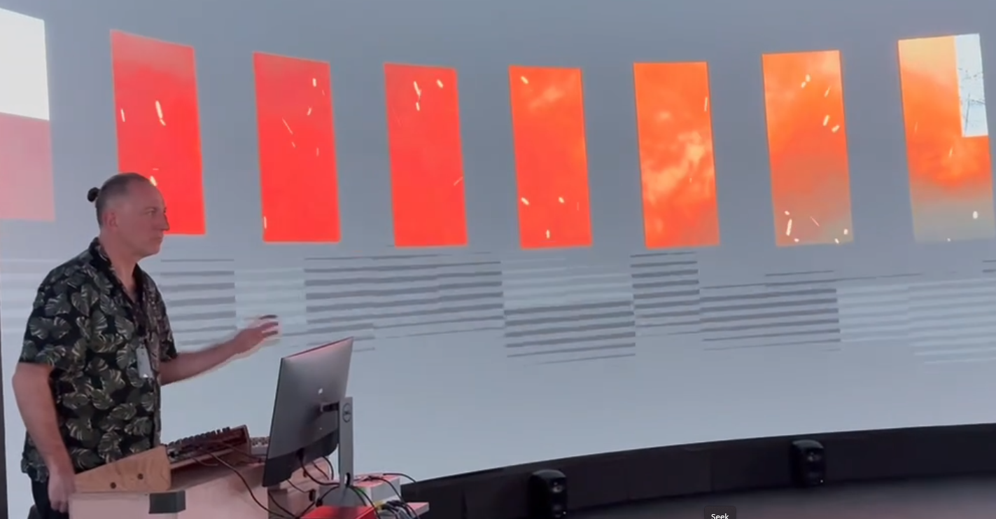
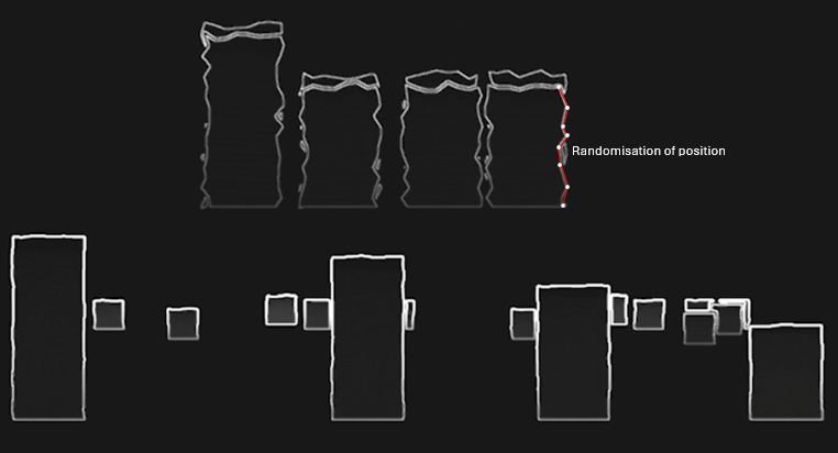
The principal mechanic of the work is a noise grid used to mix different elements of video that change according to a weighting of the following factors:
Random/Noise
Musical time (i.e. changing every 2 bars)
Response to specific instrument data (e.g. a kick drum)
The graphic below demonstrates the relationship between the noise grid and resulting video collage.
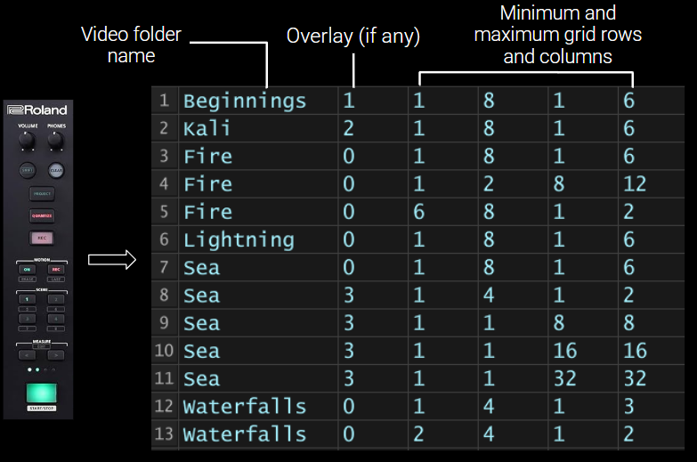
Content is organised into ‘scenes’ which map directly to scene buttons on the Roland MC-707 hardware used to drive the sound. Each scene has a number of parameters including:
A folder of video files to feed into the grid
A possible overlay layer to show on top of the grid
Parameters that relate to the randomisation of video grid divisions (i.e. a minimum and maximum number of columns and rows)
This graphic below demonstartes the relationship between the hardware scene buttons and the scene data stored in TouchDesigner.
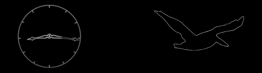
For some scenes, a monochrome overlay is shown on top of the video grid.
Incidental performative effects are mapped to audio parameters. For example, modulating the release of the snare envelope (how long or short the drum sounds) results in the video grid cells rotating to the left or right.
A classic perfomance effect within many electronic music genres is ‘beat repeat’ where a small sample of audio is repeated in time with the music. By using MIDI information to trigger audio beat repeats, a visual equivalent can also be triggered. In the case of a 16th note (semiquaver) beat repeat, a visual equivalent builds from left to right every semiquaver. Other repeat intervals are represented similarly, e.g., quaver, triplet etc.
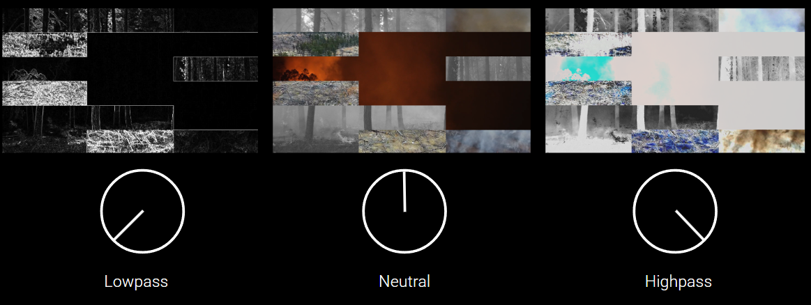
A master audio sweep filter, another common electronic music performance effect, is aligned with post visual filters i.e. final stages of the visual composition process. A black and white edge detection image is used for audio lowpass, high-brightness ‘blow out’ used for audio highpass.
The work was adapted for the 360 screen relatively quickly, so it was very much a test. However, I did have chance to perform the piece twice, each time for around 15-20 minutes which gave me a good opportunity to test out the performance mappings.
Although I don’t have a decent video capture of the event, fellow artist @oculardelusion kindly posted a couple of videos on Instagram – https://www.instagram.com/p/DWFMEk8AqM9/
Feedback from the night was generally positive although I didn’t get chance to talk to that many people in depth as I was busy performing and also co-organising the night! One interesting comment I received was that it was notable and possibly unusual for an av performer to be looking at the large screen rather than the computer screen during a performance. In fact the computer screen had nothing on it! But more importantly, this felt like the right thing to do in a large scale improvised performance situation.
The research leads me to consider a couple of themes for potential future exploration.
Theme #1: Mapping and Translation Strategies
How do different MIDI-to-visual mapping approaches affect both performer agency and audience perception? E.g., exploration of one-to-one mappings versus many-to-many relationships, examining when literal translation (note-to-shape) versus abstracted relationships work better, potentially developing a framework for “meaningful” versus “arbitrary” mappings based on practical investigation.
Theme #2: Collage Semantics & Meaning Making
What happens when found footage collage meets electronica’s functional dance context? E.g., whether narrative fragments emerge from triggering choices, investigate how juxtaposition of source materials creates meaning (or deliberately avoids it), as well as examining the politics of source material selection – whose images, from what contexts, and how does recontextualization operate?
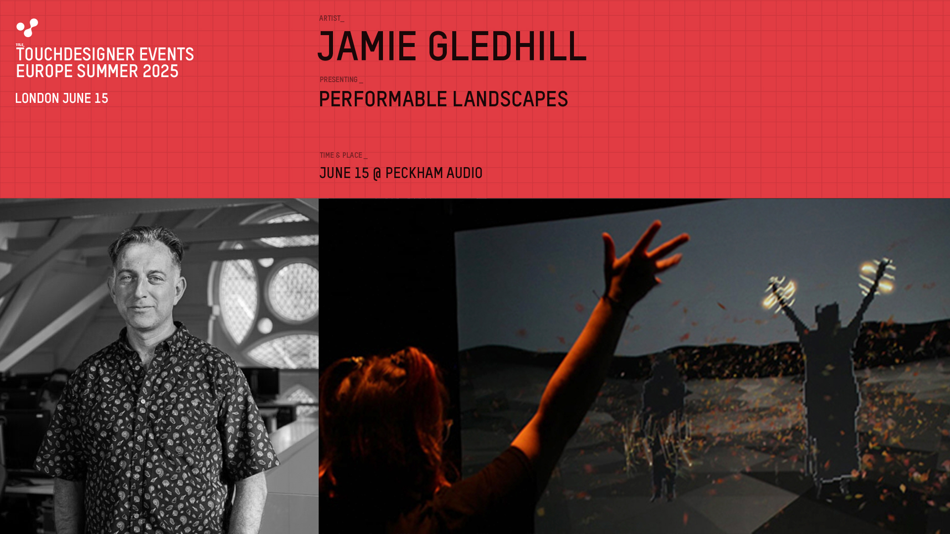
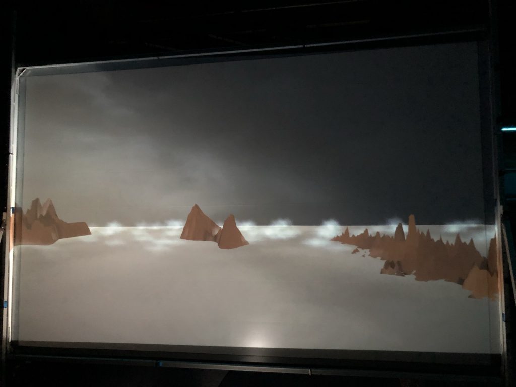
Recently I’ve been building on the performable landscapes techniques that I developed using TouchDesigner last year. In fact I gave a short presentation at a recent TD event in London, the first official event of its kind in the UK, which was fun, even if my presentation didn’t go quite to plan!
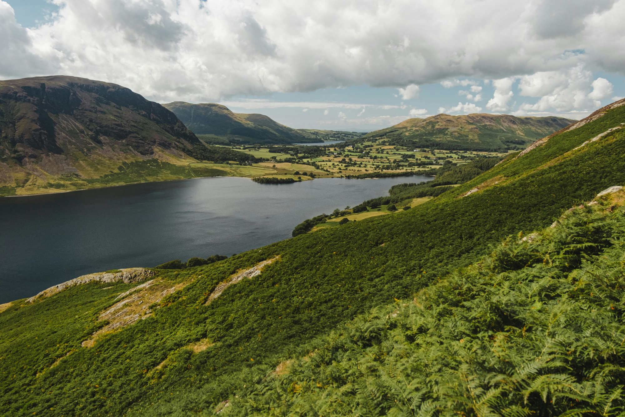
My motivation is to create a palette of landscapes that respond to musical information in realtime, i.e. MIDI and volume data, so that I can focus on playing the music and the visualisation just takes care of itself. Here are a few of the landscapes that have inspired me:
The English Lake District, a place close to my heart since childhood. Note the rounded and humped-back shapes of the hills in this view.
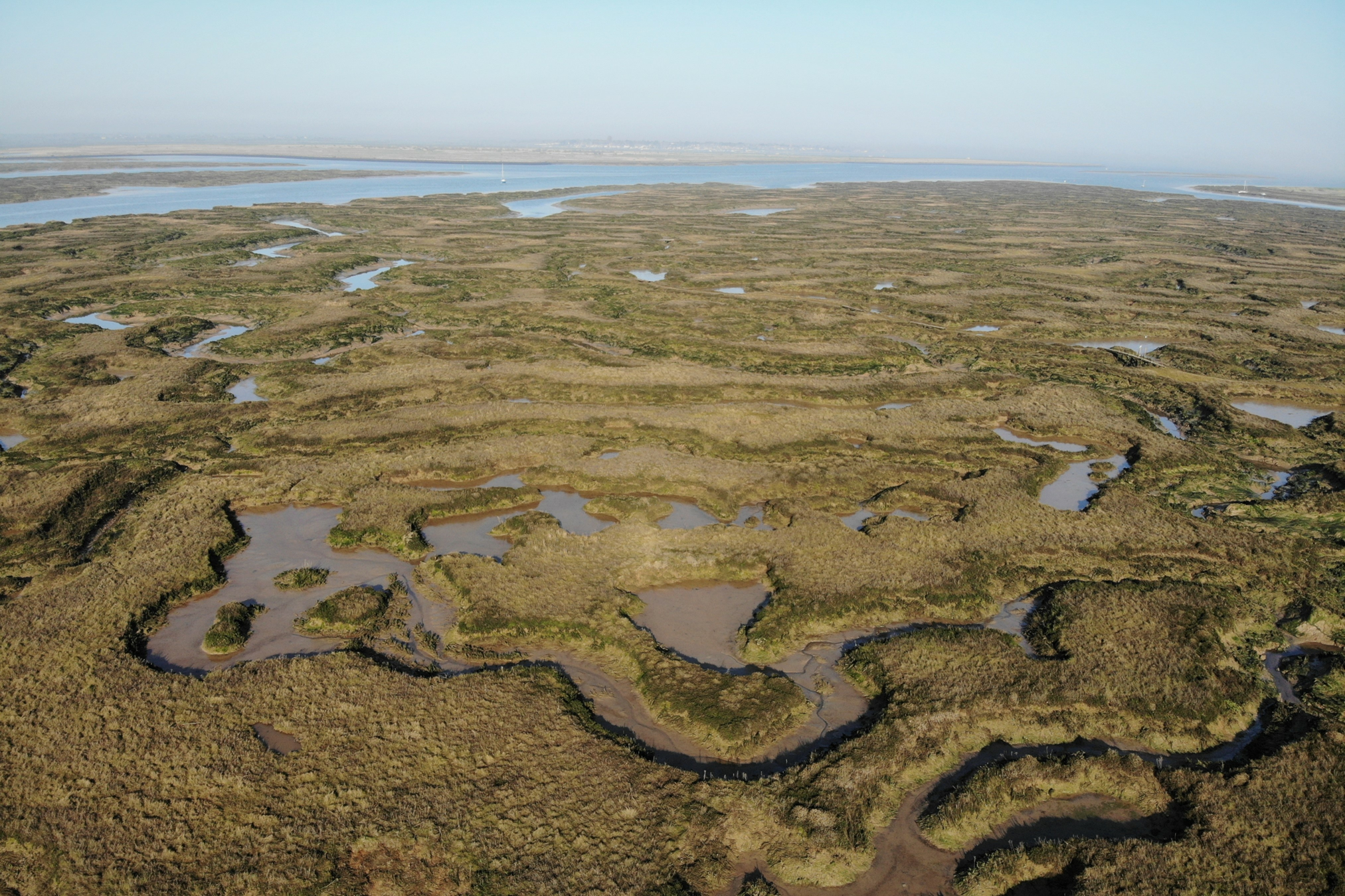
Salt marshes at Tollesbury, on the river Blackwater in Essex, an area I also know well. Note the incredibly circuitous channels of water cutting through the marsh.
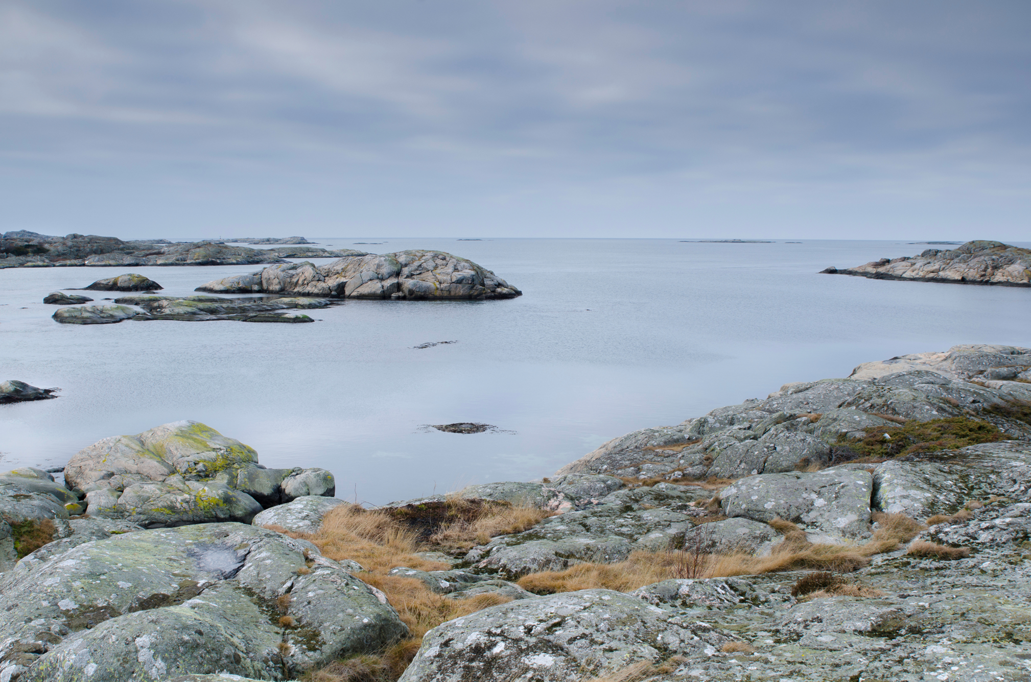
Low lying rocky islands, part of an archipeligo along the West coast of Sweden. Note the predominantly grey colour palette of this scene.
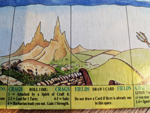
I’m also inspired by hand-painted representations of landscapes and terrain. The Talisman board game has rather endearing representations of landscapes such as the fields and crags spaces shown here. I’ve been playing this game off and on for many years so perhaps the appeal is based on nostalgia 😉
In TD it’s easy to create a simple landscape by rendering the Noise TOP in 3D (more on how to do this below). Note the characteristics of the Noise TOP as shown in the parameters dialogue on the right.
Here’s another Noise TOP with different characteristics.
By combining these TOPs using a Composite TOP, a more complex landscape can be created. In this case the Multiply blend mode is used, but other blend modes also work and provide differing results.
This is the basic rendering approach, a grid is used to generate points. Noise values are used to control the PBR material.
The classic approach to adding colour based on height is to take an output from the main noise TOP, invert it using a Level TOP and then feed that into a Lookup TOP which also has a Ramp TOP feeding it.
I have taken this a step further by using Threshold TOPs to isolate individual height bands and add a texture such as water or rock to certain parts of the final image sent to the PBR material’s Base Color Map parameter.
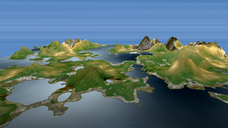
Here’s an example of a landscape using the techniques described above.
GLSL
I have more recently optimised this process using GLSL shaders to replace both the double noise technique and ramp/threshold/texture combination.
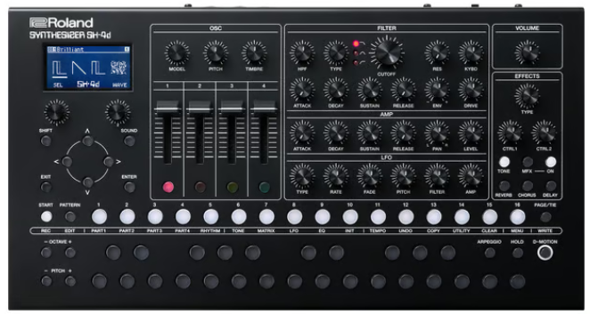
I’m using my trusty Roland Sh4D synthesiser which provides 5 separate channels of audio + the usual MIDI data over USB. This is great as I can use a combination of MIDI note, MIDI controller and channel volume level to affect the terrain. The image below shows how incoming MIDI from one of the bass channels is used to postion a deformed circle over the main noise image. If the circle was black, as shown below, it would cause a pool of water to be added to terrain at the given point. However, I have since changed this to create a hill or elavated area by changing the colour of the circle to white. The lighter the image pixels in the main noise image, the higher the terrain is rendered out as.
Audio
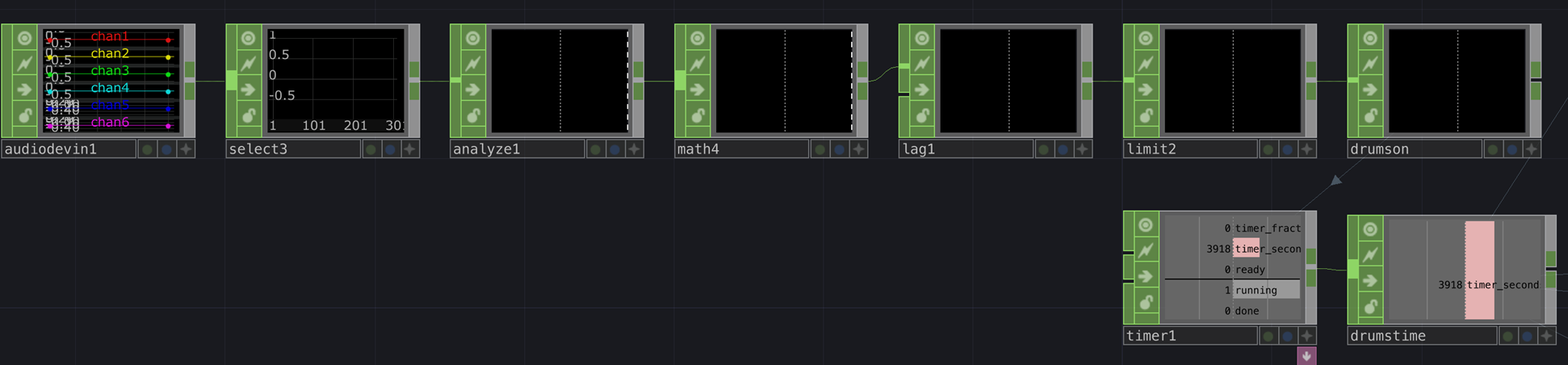
One challenge has been to create a clock that runs only when the drums are playing. I solved this by selecting the drums audio channel, using an Analyze CHOP to monitor the RMS level of the drums, which is always positive, attenuating the signal with a Math CHOP (multiplying it in this case), adding a Lag CHOP so the signal doesn’t shut off too quickly, and then passing this through a Limit CHOP set to ceiling. The net output is 0 or 1 representing when the drums are playing or not. I then connect this to a Timer CHOP which creates an accumulating value that stops and starts with the drums. I use this to drive all of the scrolling animations.
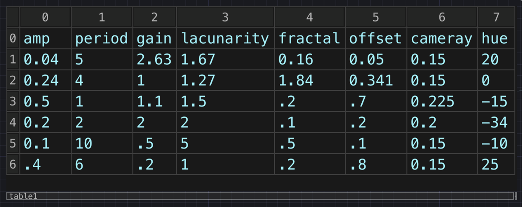
Next up, rather than tweaking every parameter in realtime and sometimes hitting on a good combination and sometimes not, I created a table that stores the values of a number of presets. This is super useful as I store all of the primary noise parameters that define each terrain preset + additional information such as camera y position, which changes slightly according to how high the preset extends. I also use the current index to control the choice of colour Ramp TOP and texture set-up per preset.
Finally, I had been testing the presets using number keys, but I decided to make the preset change at random every so many bars. This is achieved by simply having a drum note that doesn’t make any sound at the beginning of a bar. Although the drum is silent, it still sends a MIDI signal which is used to trigger the preset change.
There are various other embellishments I have made and many more I would like to make, but I feel that I need to draw a line under the project, at least for now. Here’s a video excerpt of the performable landscape in action.
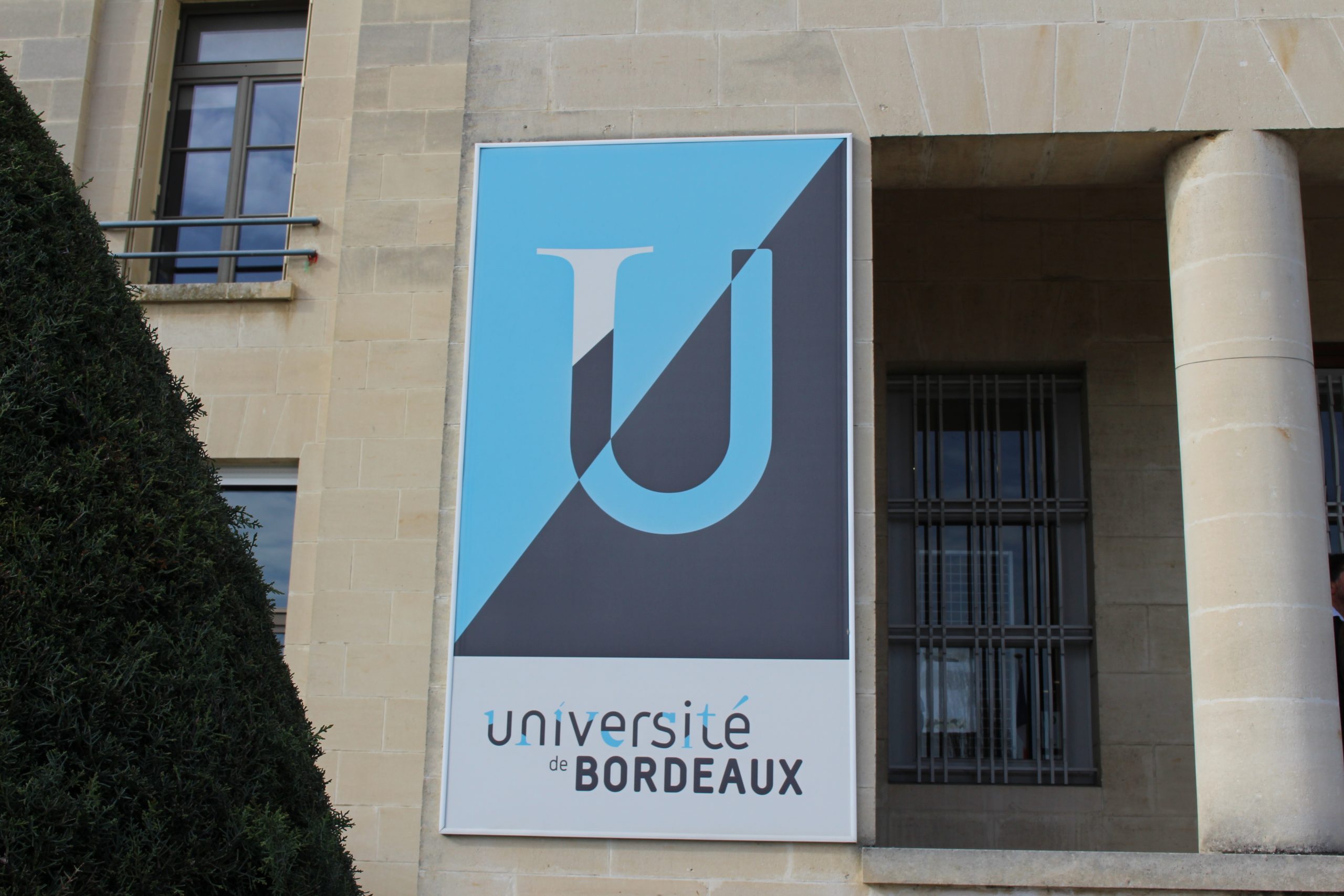
I’ve recently returned from the Nineteenth International Conference on Tangible, Embedded, and Embodied Interaction (TEI’25) hosted by Université Bordeaux. This was my first experience of TEI and it was really insightful and encouraging to meet and hear from international researchers and creative practitioners at the forefront of tangible interaction in its many forms. This annual conference is essentially an international community of talented makers keen to constructively critique one another’s research and practice.
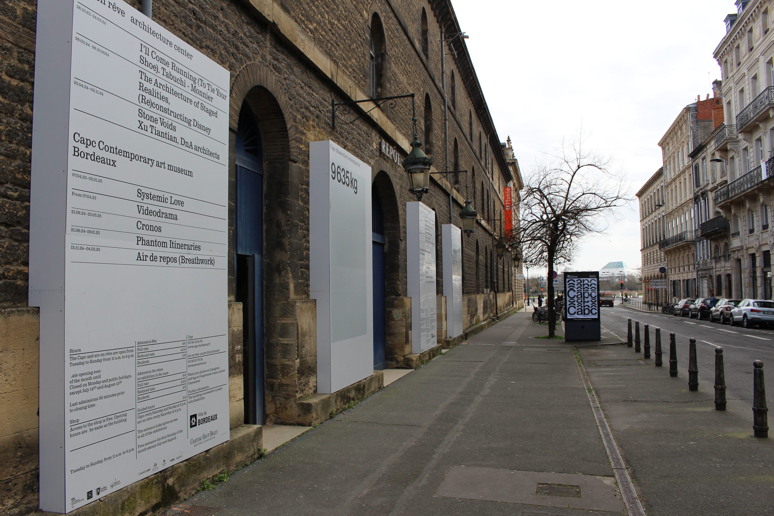
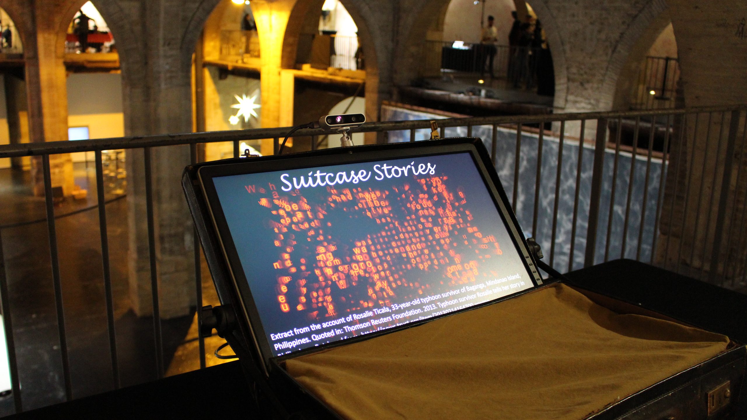
I was very happy to show an installation ‘Suitcase Stories’ which was included as part of the conference Arts and Perfomance track, exhibiting at Capc Contemporary Art Museum Bordeaux. I proposed Suitcase Stories in response to the Art and Performance call which asked artists to propose an art work fitting into a suitcase, somewhat inspired by La Boîte-en-Valise [Box in a Suitcase] by Marcel Duchamp, also responding to the conference theme of sustainability.
A number of themes I had previously been considering fed into the ideation process. Firstly, the 17 United Nations Sustainable Development Goals, many of which are concerned with improving social and personal factors, not just developing infrastructure, although these aspects are evidently interrelated. Secondly, lived experience and personal testimony of climate change – I personally find first hand accounts of subjects such as flooding and drought very moving. Thirdly, bodily interaction with typography as a way to develop a near-physical relationship with narrative.
This led me to develop the following proposal:
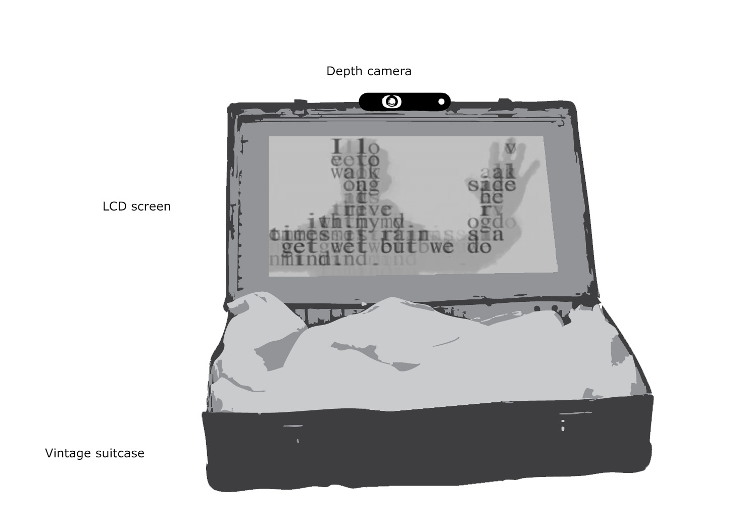
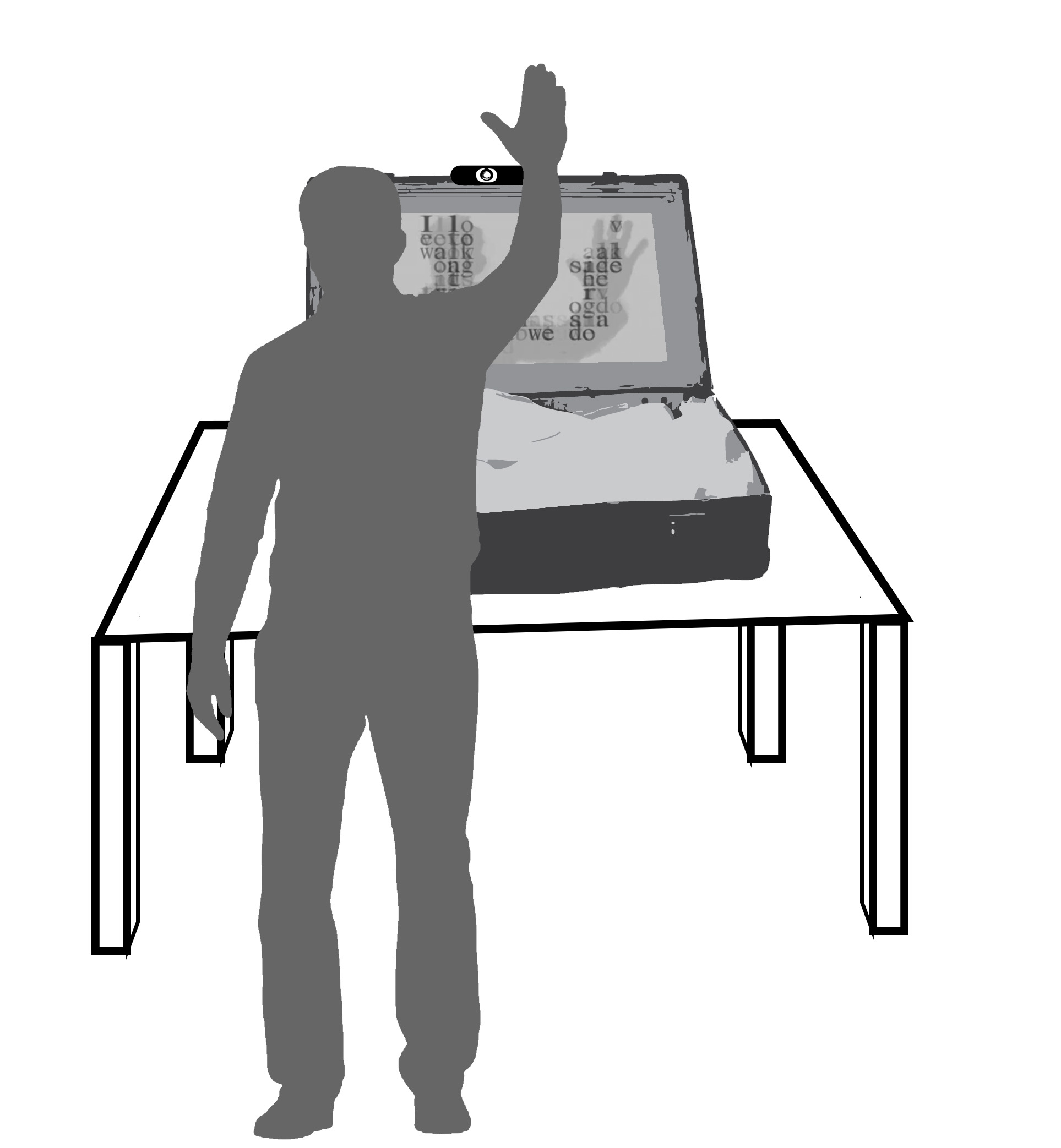
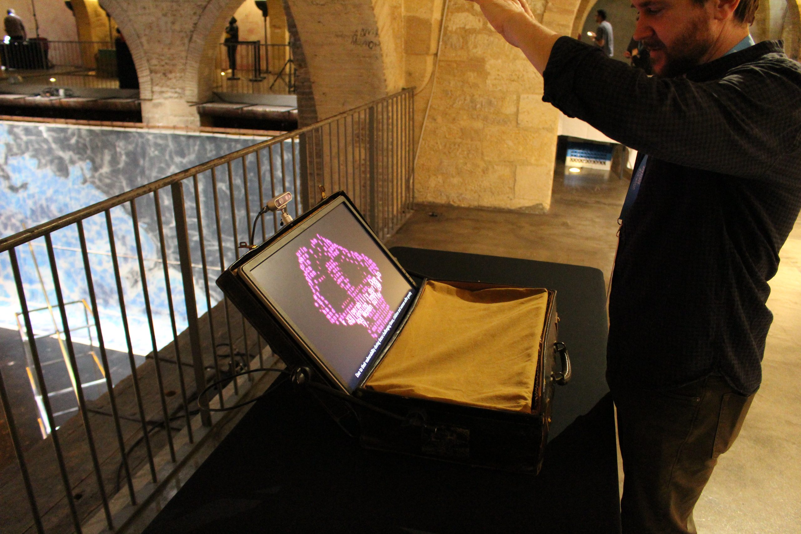
The Suitcase Stories installation facilitates embodied interaction with typographic representations of firsthand accounts of climate change. The work aspires to create a powerful and visceral connection between the participant and individuals affected directly by environmental changes, thus developing greater awareness and propensity towards positive action. Participants interact with powerful and often emotive narratives through upper body movement and gesture, discovering and playing with words and phrases. The entire artwork is integrated within a vintage suitcase, adding aesthetic and thematic dimensions to the user experience. Through this installation, the author sets out to test whether interactive typography, controlled through body tracking, can offer a unique platform for disadvantaged voices to be heard in a powerful and immersive way.
I developed the following lo-fi mock-ups to support the proposal.
Although I had already created bodily-interactive typography some years ago (e.g. Journey Words), this was created using now defunct Quartz Composer patches and recently I have been keen to push the limits of TouchDesigner. So, with just a weekend to create a prototype from scratch in time for the application deadline, I managed to develop the following demo in TouchDesigner.
My proposal was thankfully accepted and I started work in earnest on the installation following the Christmas break. My first task was to find suitable first-hand accounts of climate change that I could legitimately use. After some discourse with organisations such as the Climate and Migration Coalition, it became apparent that several first-hand accounts published by organisations such as Oxfam are already widely shared, with due reference, across media platforms. In the end I re-used and referenced the following accounts:
1
Extract from the account of Marcos Choque, 67-year-old inhabitant of Khapi, in the Bolivian Andes.
Oxfam International. 2009. Bolivia: Climate change, poverty and adaptation. Oxfam International, La Paz, Bolivia.
2
Extract from the account of Sefya Funge, 38-year-old farmer in Adamii Tulluu-Jido Kombolcha, Ethiopia.
Oxfam International. 2010. The Rain Doesn’t Come on Time Anymore – Poverty, Vulnerability, and Climate Variability in Ethiopia. Oxfam International, Oxford, UK.
3
Extract from the account of Tulsi Khara, 70-year-old inhabitant of the Sundarbans, in the Ganges delta, India. Quoted in: WWF. 2005. Climate Witness: Tulsi Khara, India.
WWF. 2005. Climate Witness: Tulsi Khara, India. Retrieved from: https://wwf.panda.org/es/?22345/Climate-Witness-Tulsi-Khara-India
4
Extract from the account of Rosalie Ticala, 33-year-old typhoon survivor of Baganga, Mindanao Island, Philippines.
Thomson Reuters Foundation. 2013. Typhoon survivor Rosalie tells her story in Philippines. Retrieved from: https://news.trust.org/item/20130214164700-xrwmo
5
Extract from the account of Fatay and Zulaikar, husband and wife of a pastoralist family in Badin district, Sindh, Pakistan.
Quoted in: Climate & Development Knowledge Network. 2012. Disaster-proofing your village before the floods – the case of Sindh, Pakistan. Retrieved from: https://cdkn.org/story/disaster-proofing-your-village-before-the-floods-%25e2%2580%2593-the-case-of-sindh-pakistan
6
Extract from the account of Assoumane Mahamadou Issifou, NGO employee in Agadez, Nigeria. Gavi,
Quoted in: The Vaccine Alliance. 2023. Ten eyewitness reports from the frontline of climate change and health. Retrieved from: https://www.gavi.org/vaccineswork/ten-eyewitness-reports-frontline-climate-change-and-health
7
Extract from the account of Parbati Ghat, 58-year-old community health volunteer in Melauli, Baitadi, Nepal.
Quoted in: BBC Media Action, Living Climate Change. 2024. Mosquitoes in the mountains, Nepal. Retrieved from: https://www.bbc.co.uk/mediaaction/our-work/climate-change-resilience/living-climate-change/nepal-malaria
8
Extract from the account of Lomilio Ewoi, pastoralist in Kenya.
Quoted in: BBC Media Action, Living Climate Change. 2024. The flood that took everything, Kenya. Retrieved from: https://www.bbc.co.uk/mediaaction/our-work/climate-change-resilience/living-climate-change/kenya-mental-health
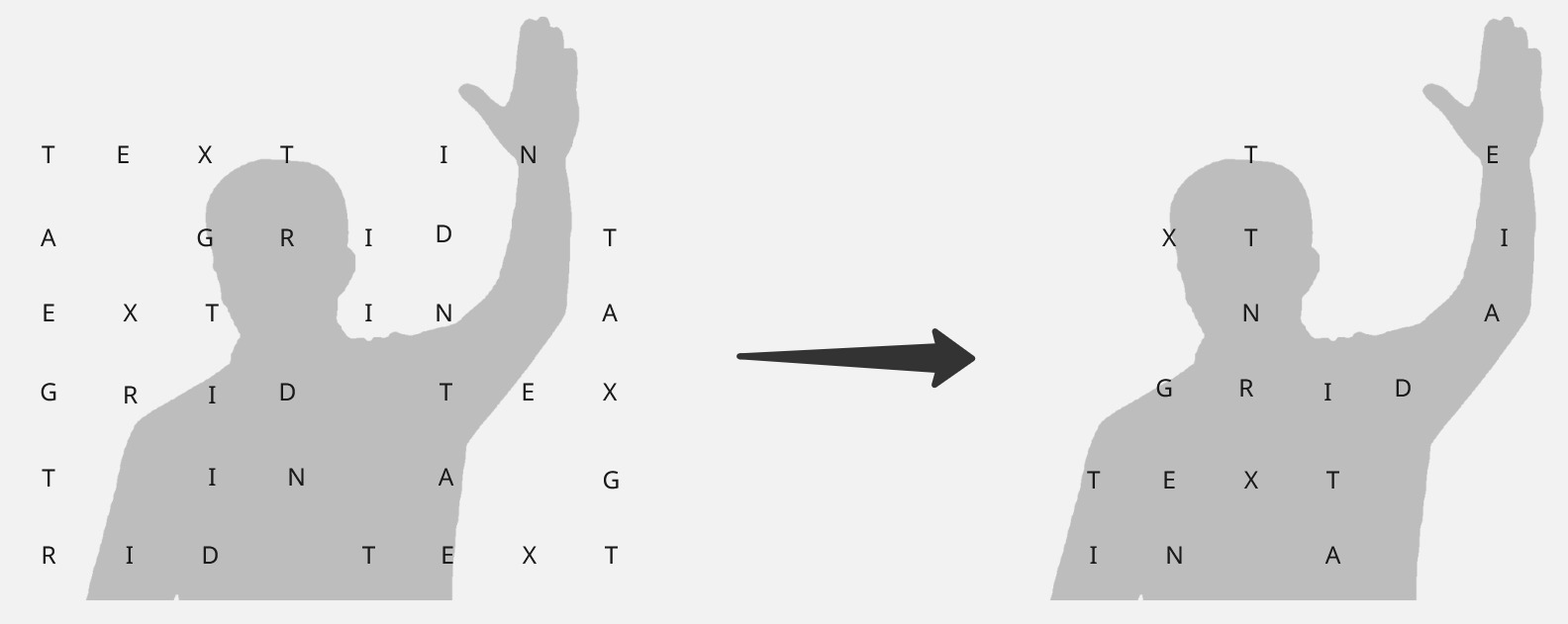
The TouchDesigner development process was quite time-consuming although I managed to achieve an outcome by resolving challenges in key stages. My original demo essentially mixed a Kinetic Typography tutorial by bileam tschepe (elekktronaut) with a 3D Grid with Depth Camera tutorial by Motus Art. This resulted in a grid of letters extruded using depth information provided by a RealSense D345 camera. However, I wanted to only show letters extruded by the body and not those on the background grid, but keeping the left to right flow of text, as shown in the diagram below.
I managed to do this by using a threshold filter to isolate image pixels above a certain greyscale level and therefore considered to be part of the body, and then used this information to reorganise the text indices relating to each grid cell so that text only appeared on cells extruded by the body.
With artistic works featuring typography, there is often a tension between aesthetics and legibility. I wanted participants to enjoy playing with the text, forming ‘word sculptures’ with their bodies, but ultimately they needed to be able to read the text. To this end, I developed a phrase cycling function that sequentially picked out individual phrases when the participant stopped moving and after a short delay, showed them as pure text overlayed along the bottom of the screen. Although it perhaps seemed slightly obvious to do so, I wanted to ensure 100% legibility of these important stories.
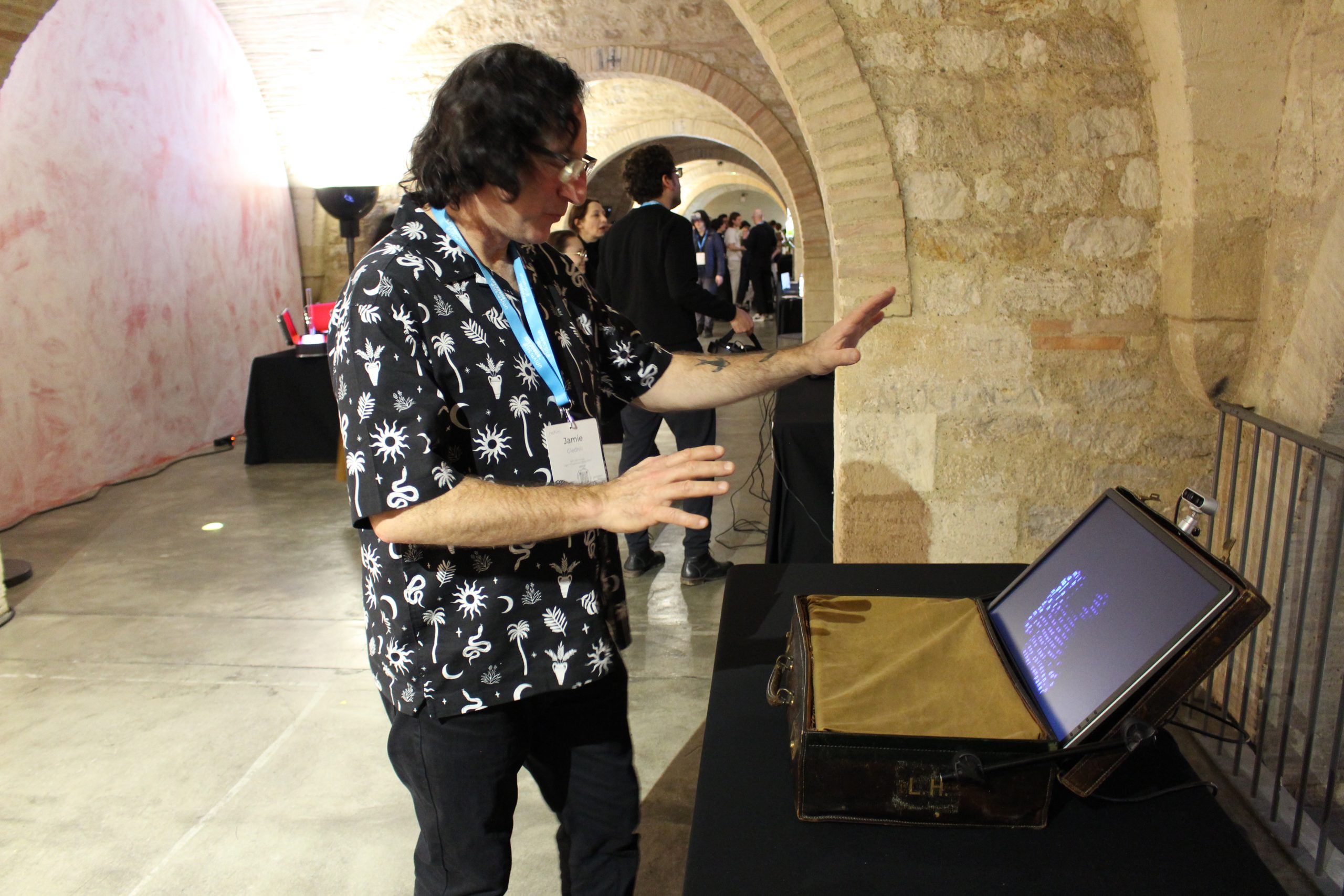
The fabrication side of the project came together quite serendipitously, I found a medium-sized, yet robust, vintage suitcase in an antique bazaar which just happened to be a perfect fit for an old monitor. I used photography mounting components to hold the lid of the suitcase open and support the weight of the monitor, then created a mount for the RealSense camera in the suitcase lid. After several failed attempts trying to get the RealSense camera working with my MacBook (official RealSense support for Mac is discontinued by Intel), I managed to borrow a gaming PC laptop and house that in the body of the suitcase. The last additions were a fan to cool the laptop down and some suitable material to stretch across the interior of the suitcase (which by now had several holes cut into it). You can see the results in the images below.
I had some really useful and insightful feedback from the conference attendees and also a number of productive conversations about using technology to explore human narratives – essentially Digital Humanities. I’m taking a break from this project for a short while to reflect upon where it might go next. In the meantime, if you’re interested in reading the accompanying ACM short paper, you can find it here: https://dl.acm.org/doi/pdf/10.1145/3689050.3707677
And here is a screen recording demonstrating the phrase selection functionality as it was presented at TEI’25.
Of late I have been working with TouchDesigner (TD) to visualise landscapes that respond in realtime to incoming MIDI data, with a view to creating performable work.
There are some great examples of audio-responsive terrain being rendered in realtime such as Audio Landscape by Dan Neame, which use audio frequencies to manipulate terrain using the 3D JavaScript library three.js.
TouchDesigner, a node-based visual programming language for real-time interactive multimedia content, is somewhat of a goto in respect to creating audio responsive graphics e.g. the famous Joy Division album cover simulation created by Aurelian Ionus.
My first attempt using TD to create a MIDI-responsive landscape builds upon the Outrun / Landscapes tutorial by Bileam Tschepe (elekktronaut). Sound and MIDI data are provided by a Roland SH-4D hardware synthesiser.
Realtime Sound Landscape #1
Since then, I have implemented a handful of key rendering improvements, not least GPU instancing as demonstrated by supermarketsallad in his TD tutorial Generative Landscapes.
My second attempt also incorporates better texture mapping and contour smoothing. This version use the TDAbleton package to route musical and audio level data directly from digital audio workstation Ableton Live to TD, both running on the same machine.
Realtime Sound Landscape #2
This is work in progress, so I will follow up with more detail and explanation in due course.
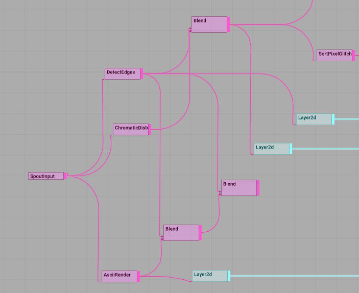
I thought I better post the outcome of a recent experiment using Processing and Tooll3 together to transform incoming MIDI notes and controller information into realtime visual output.
Processing is used to create and manipulate animated geometric shapes that correspond to notes produced by individual synth tracks, building on previous work undertaken in p5.js. After significant stress testing, it turned out that Java-based Processing is slightly better suited to this purpose than JavaScript-based p5.js, e.g., in relation to response time and overall stability.
Processing forwards the live image using the Spout library to Tooll3, a free VJ platform, which is used to add effects. Tooll3 has amazing visual capabilities although it suffers from a somewhat limited MIDI implementation and is currently PC-only.
Check the results out below.
If you’re interested in more detail, read on.
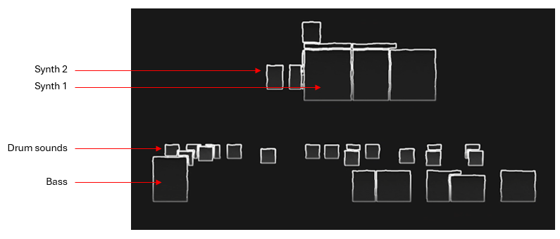
Processing is used to create block shapes for each MIDI note. Each instrument is assigned to a unique MIDI channel and this distinction is used to create a separate line of shapes for each instrument.
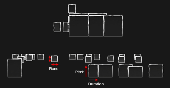
Drum shapes (kick drum, snare etc.) have fixed dimensions, all other shapes are influenced by MIDI note duration and pitch.
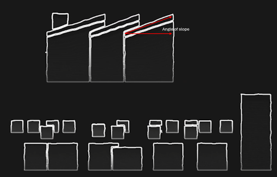
The slope of a note shape is controlled by MIDI controller information, for Synth 1 this relates to the frequency cutoff of the sound.
Each note shape has many additional vertices along each side which can be displaced using random values to create a wobbling effect. In this case, Synth 1 shapes wobble in response to MIDI pitch modulation data – e.g., the classic 80’s synth pitch modulation.
Processing is also used to colour the shapes, this is triggered either manually using a MIDI controller or via non-rendering MIDI information. Essentially, I used one of the Elektron sequencer channels to control visual changes matching the current phrase. The MIDI data from this channel did not itself produce shapes.
All the shapes are drawn in 2D with a scale factor derived from notional z axis values using the following simple perspective calculation where fl = represents focal length.
scale = fl / (fl + z)
I had considered that I might change perspective values on the fly but in the end didn’t pursue this.
Processing is great for handling MIDI and drawing shapes but not so good for post-processing which is where an application like Tooll3 comes in handy. It was straightforward enough to pipe the fullscreen Processing image through to Tooll3 using Spout and then apply various image filters as shown below.
Tooll3 applying image effects to the Spout input provided by Processing.
The MIDI visual control track was used to trigger and switch between these various effects. I didn’t get on very well with the MIDI implementation offered by Tooll3 but it is possible this has since improved.
This was a fun project to work on and Tooll3 is quite inspiring, although it doesn’t have anywhere near the level of community support that TouchDesigner does. I’m planning to investigate the latter more thoroughly as a realtime AV platform some time soon.
I’ve been re-exploring p5.js recently (a JavaScript library for creative coding) and am pleased to see a growing number of additions that make it look more and more like a fully fledged creative platform.
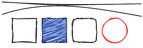
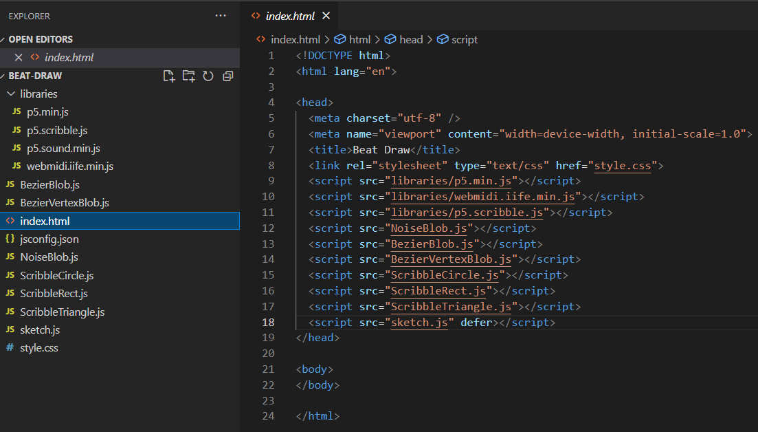
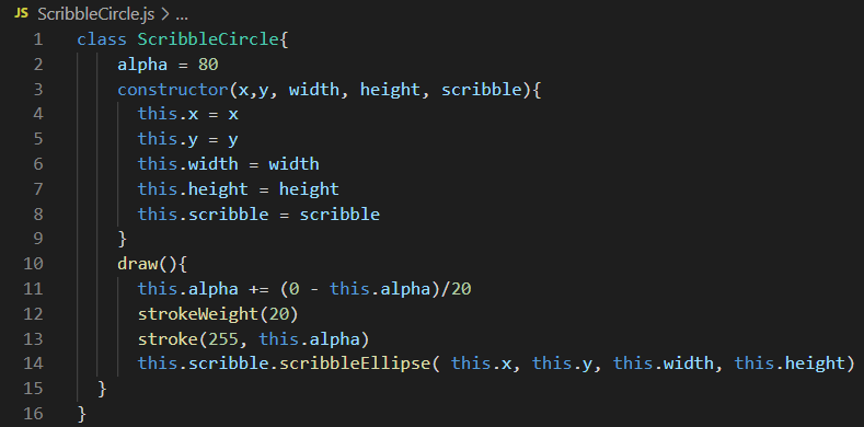
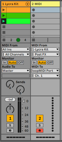
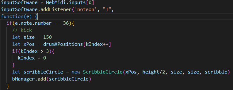
As a proof of concept I created a simple sketch that visualises basic geometric shapes in response to incoming MIDI notes. I used the excellent p5.scribble.js library and the super useful WEBMIDI.js utility.
Shapes drawn using p5.scribble.jsA sub-optimal directory structure, but good enough for a proof of concept.WEBMIDI is well documented and easy to use – see the WEBMIDI Basics documentationFollowing OOP principles, I created custom drawing classes for the specific shapes that I wanted to visualise, each with its own draw method making use of appropriate p5.scribble functions.In Ableton, I created a simple drum pattern.And sent the outgoing MIDI to a virtual port via Loop MIDI.Back in p5, I added a listener for the incoming MIDI notes, instantiated the relevant drawing class for each one and passed it to the ‘BlobManager’, responsible for managing time-limited visibility for each note shape.
It all went smoothly and resulted in a fairly responsive, if very simple, audio visual proof of concept. Interestingly enough, when I ported the code to good old fashioned Processing, which uses Java rather than JavaScript, I saw no difference in perfomance or latency which makes me think that p5 is just as good a choice as Processing for creative experimentation.
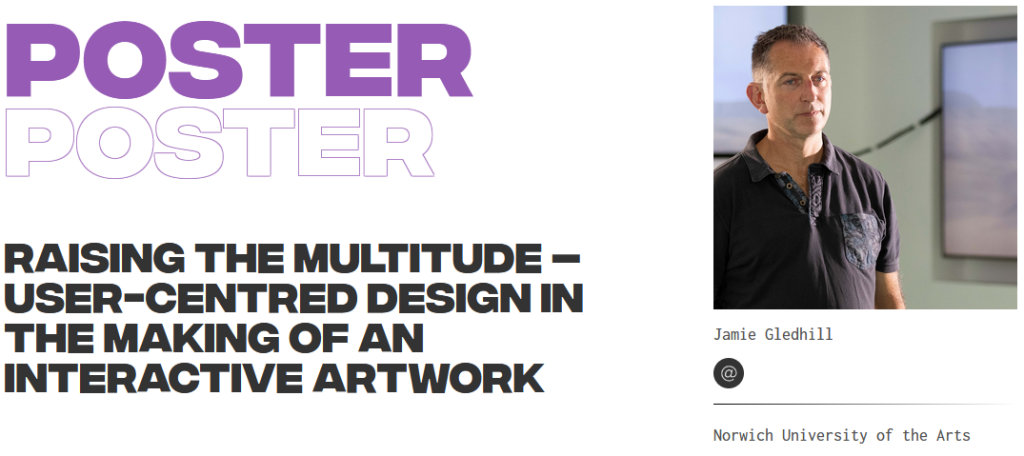
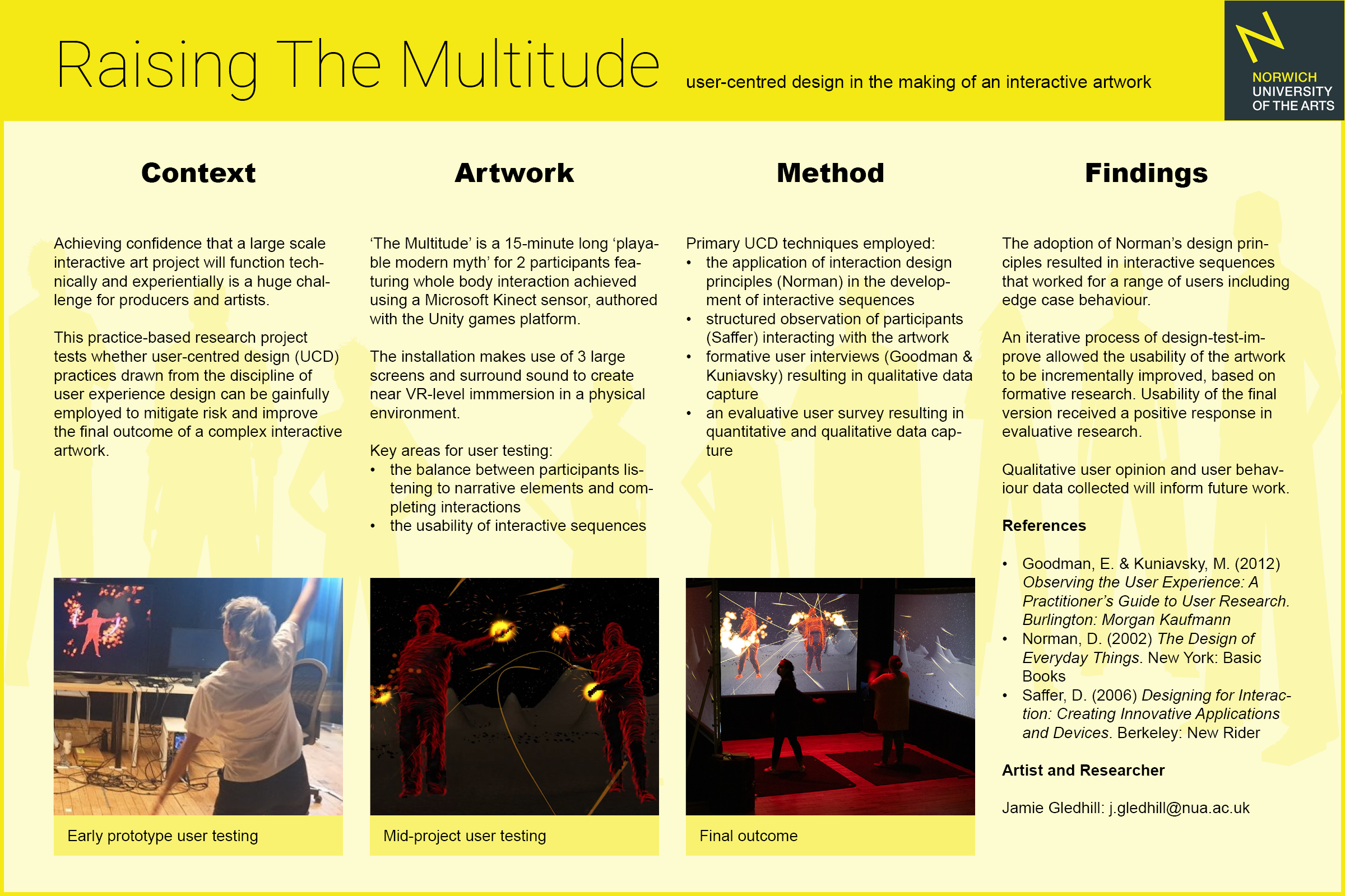
On October the 20th, 2021, I presented my preliminary research findings from The Multitude project at Beyond 21, ‘a conference where thinkers, makers, investors and researchers across the creative industries come together to explore the relationship between creative research and business innovation’. The event was physically held in Belfast with many elements presented online.
Here is the research poster that I submitted (select to enlarge):
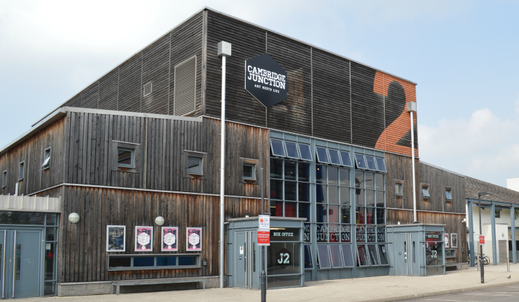
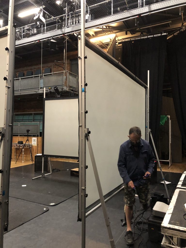
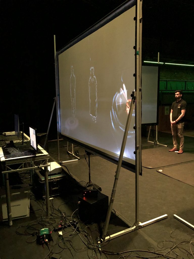
Myself and producers Collusion recently tested The Multitude at Cambridge Junction in preparation for exhibition in late June.
Cambridge Junction
The installation requires a technically demanding set-up with multiple screens, speakers and programmable lights.
Routing leads
Checking positioning
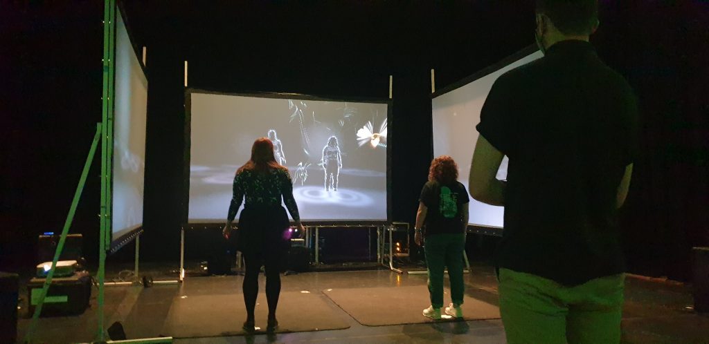
We had a couple of technical glitches, as to be expected, but managed to do a few run throughs with testers in the late afternoon.
Our very first testers!More testersThese two should know what they’re doing (artist and producer)
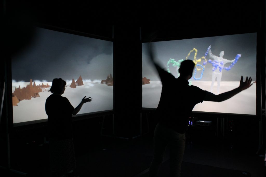
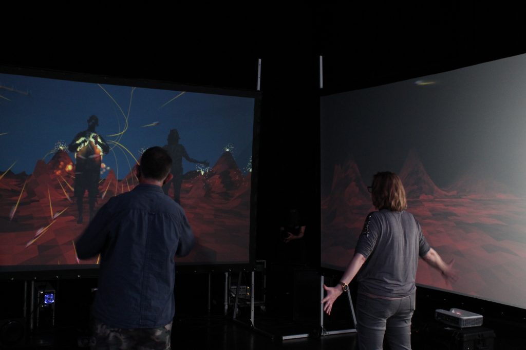
Generally, the installation worked well, but there are some tweaks to be made, as to be expected.
Some of the voices need to be re-scripted slightly and re-recorded
The sound design generally works although needs to be completed
The aesthetics need developing more for some scenes
Object placement needs to be improved to make the most out of the 3 screen set up
The core interactions require minor tweaking
Secondary interactions need to be added to give players something to do during the character introductions
There is actually quite a long list of minor tasks that need to be completed in the coming weeks, the above are just the highlights based on user feedback.
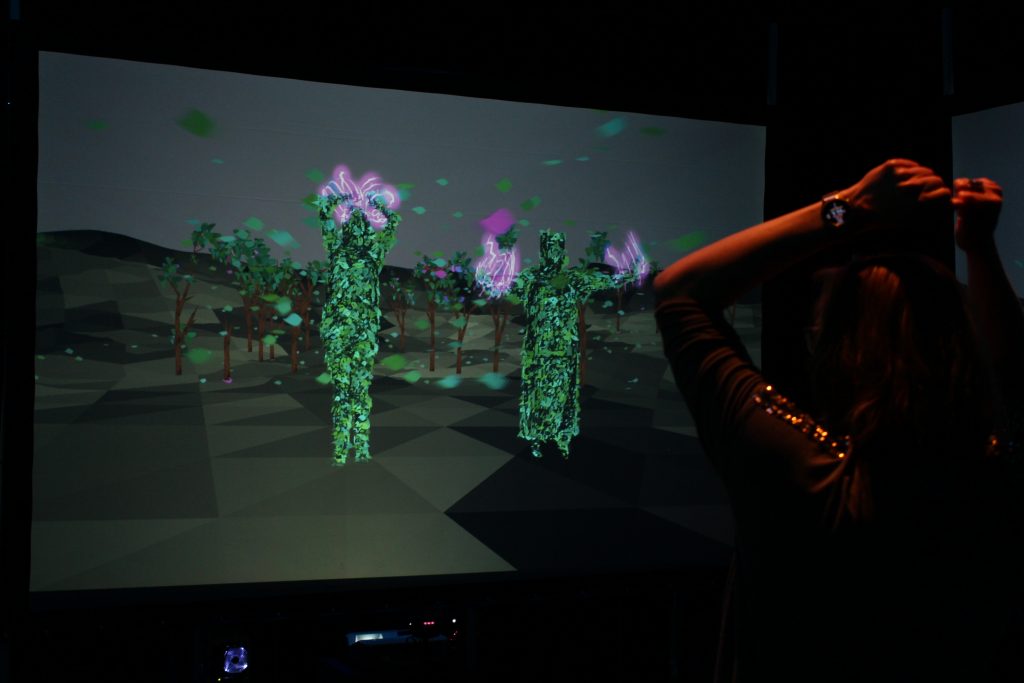
A side panel from the Air Elemental scene, one of the more visually resolved scenes.
It’s been a while since I last posted about the Vision Mixers project, not least because of two intervening lockdowns in England and general Covid-19 uncertainty. Despite all this and as well as a very busy start to this academic year, I have been progressing steadily with project development.
The good news is that the project, now known as ‘The Multitude’, has just been awarded an Arts Council England grant to support further development, testing and exhibition. This is obviously a welcome development and means that the work will be shown in both Cambridge, Norwich and potentially another city over the coming months.
So, the general aim of the project is to create a ‘playable experience’ for two, lasting 15-20 minutes, where the players step through a series of interactive scenarios. The experience is framed by a narrative construct that pits the players against ‘a demon’ that has recently cursed humanity, an act allegorical to the current pandemic crisis. Part of my interest in the narrative component comes from the idea of myth making, particularly in the face of danger and crisis. I was moved by the excellent Fairy-Tale Virus by Sabrina Orah Mark, published in the Paris Review, to think about how a modern fairy tale might be constructed to help mediate the current crisis.
The 1954 film Godzilla is an example of a modern fairy tale (they’re often violent and feature monsters!) that was developed in the aftermath of the atomic destruction of Hiroshima and Nagasaki less than a decade earlier.
In The Multitude, the players cannot defeat the evil demon directly and must instead enlist the help of the four ‘elementals’: Earth, Water, Fire and Air. By fulfilling a task for each of the elementals, which forms the basis of player interaction for each scene, the players hope to awaken a sleeping army of ancient warriors known as ‘the multitude’, hence the name.
The research aims of the project have now been tweaked slightly. They are to investigate:
the nature of agency and how this is mediated through performative interaction
the mechanics of co-interaction
non-contact interaction design, especially in the context of the current Covid-19 crisis
the use of narrative to frame interactive experience
The research methodology is essentially to make the initial version of the work, conduct a round of early stage usability testing, iterate and then conduct more extensive audience testing at each exhibition opportunity. Usability testing will cover the nuts and bolts of interaction design and hopefully identify any significant problem areas. Audience testing will gauge sentiment and reaction, looking at for example, the success or otherwise of the narrative-interaction mix.
The project is quite sizeable already and will ultimately amount to many thousand lines of code written. A significant research output will be a technical review, but this will be framed within the context of interaction design rather than the discipline of computer programming. Coding is a means to an end in this case! For information purposes: the platform is Unity and interaction is achieved through the Microsoft Kinect for Windows.
This video gives an overview of the development work completed until November 2020.