All posts by jg

Performable Landscapes

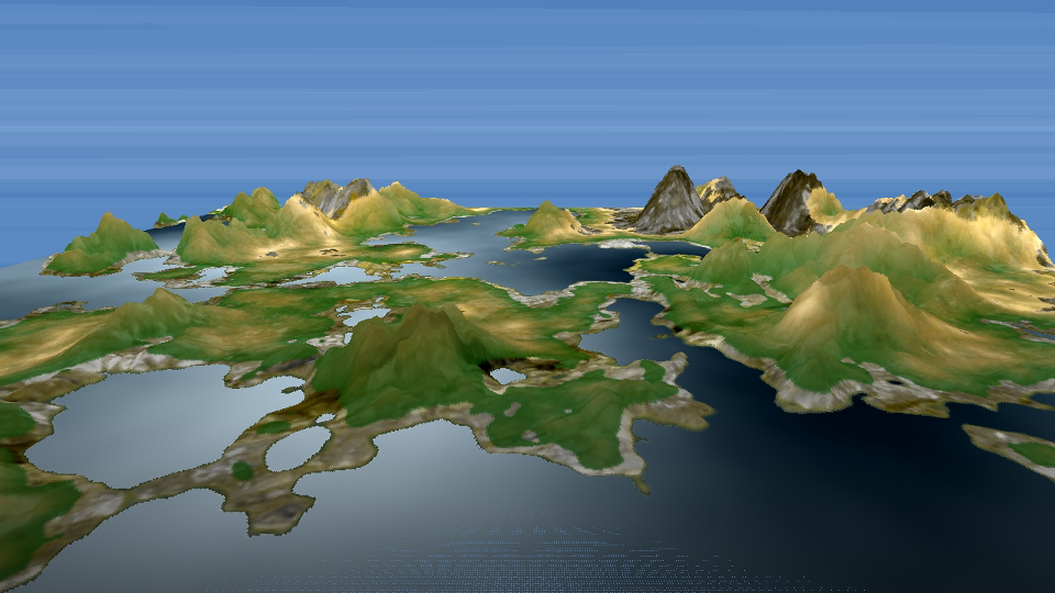
Of late I have been working with TouchDesigner (TD) to visualise landscapes that respond in realtime to incoming MIDI data, with a view to creating performable work.

There are some great examples of audio-responsive terrain being rendered in realtime such as Audio Landscape by Dan Neame, which use audio frequencies to manipulate terrain using the 3D JavaScript library three.js.

TouchDesigner, a node-based visual programming language for real-time interactive multimedia content, is somewhat of a goto in respect to creating audio responsive graphics e.g. the famous Joy Division album cover simulation created by Aurelian Ionus.

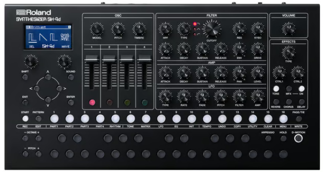
My first attempt using TD to create a MIDI-responsive landscape builds upon the Outrun / Landscapes tutorial by Bileam Tschepe (elekktronaut). Sound and MIDI data are provided by a Roland SH-4D hardware synthesiser.

Realtime Sound Landscape #1

Since then, I have implemented a handful of key rendering improvements, not least GPU instancing as demonstrated by supermarketsallad in his TD tutorial Generative Landscapes.

My second attempt also incorporates better texture mapping and contour smoothing. This version use the TDAbleton package to route musical and audio level data directly from digital audio workstation Ableton Live to TD, both running on the same machine.

Realtime Sound Landscape #2

This is work in progress, so I will follow up with more detail and explanation in due course.

Realtime AV using Processing and Tooll3

I thought I better post the outcome of a recent experiment using Processing and Tooll3 together to transform incoming MIDI notes and controller information into realtime visual output.

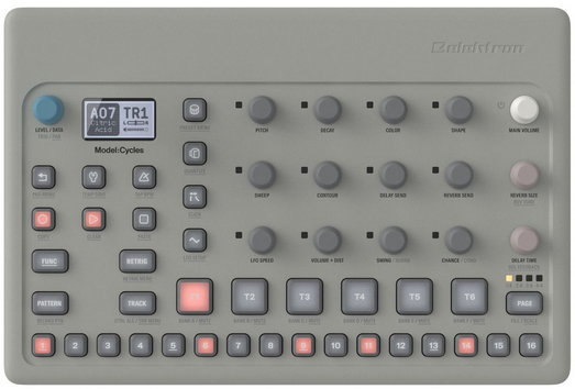
The MIDI and sounds are generated by hardware synths – Roland SH-4D and Elektron Model Cycles.

Roland SH-4D
Elektron Model Cycles

Processing is used to create and manipulate animated geometric shapes that correspond to notes produced by individual synth tracks, building on previous work undertaken in p5.js. After significant stress testing, it turned out that Java-based Processing is slightly better suited to this purpose than JavaScript-based p5.js, e.g., in relation to response time and overall stability.

Processing forwards the live image using the Spout library to Tooll3, a free VJ platform, which is used to add effects. Tooll3 has amazing visual capabilities although it suffers from a somewhat limited MIDI implementation and is currently PC-only.

Check the results out below.

If you’re interested in more detail, read on.

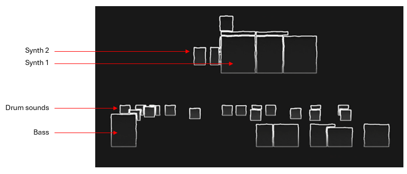
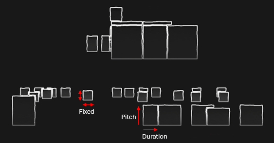
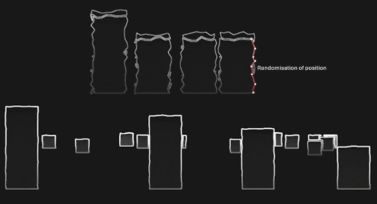
Processing is used to create block shapes for each MIDI note. Each instrument is assigned to a unique MIDI channel and this distinction is used to create a separate line of shapes for each instrument.

Drum shapes (kick drum, snare etc.) have fixed dimensions, all other shapes are influenced by MIDI note duration and pitch.

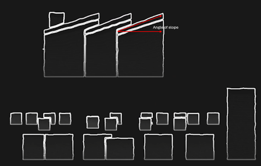
The slope of a note shape is controlled by MIDI controller information, for Synth 1 this relates to the frequency cutoff of the sound.

Each note shape has many additional vertices along each side which can be displaced using random values to create a wobbling effect. In this case, Synth 1 shapes wobble in response to MIDI pitch modulation data – e.g., the classic 80’s synth pitch modulation.

Processing is also used to colour the shapes, this is triggered either manually using a MIDI controller or via non-rendering MIDI information. Essentially, I used one of the Elektron sequencer channels to control visual changes matching the current phrase. The MIDI data from this channel did not itself produce shapes.

All the shapes are drawn in 2D with a scale factor derived from notional z axis values using the following simple perspective calculation where fl = represents focal length.

scale = fl / (fl + z)

I had considered that I might change perspective values on the fly but in the end didn’t pursue this.

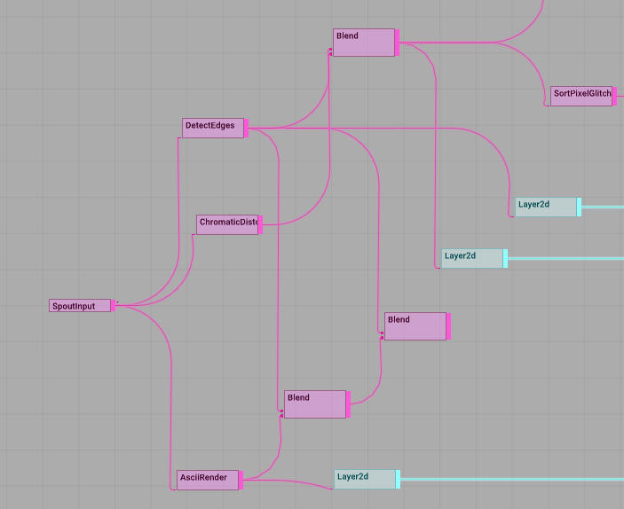
Processing is great for handling MIDI and drawing shapes but not so good for post-processing which is where an application like Tooll3 comes in handy. It was straightforward enough to pipe the fullscreen Processing image through to Tooll3 using Spout and then apply various image filters as shown below.

Tooll3 applying image effects to the Spout input provided by Processing.

The MIDI visual control track was used to trigger and switch between these various effects. I didn’t get on very well with the MIDI implementation offered by Tooll3 but it is possible this has since improved.

This was a fun project to work on and Tooll3 is quite inspiring, although it doesn’t have anywhere near the level of community support that TouchDesigner does. I’m planning to investigate the latter more thoroughly as a realtime AV platform some time soon.

MIDI > P5

I’ve been re-exploring p5.js recently (a JavaScript library for creative coding) and am pleased to see a growing number of additions that make it look more and more like a fully fledged creative platform.

As a proof of concept I created a simple sketch that visualises basic geometric shapes in response to incoming MIDI notes. I used the excellent p5.scribble.js library and the super useful WEBMIDI.js utility.

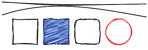
Shapes drawn using p5.scribble.js

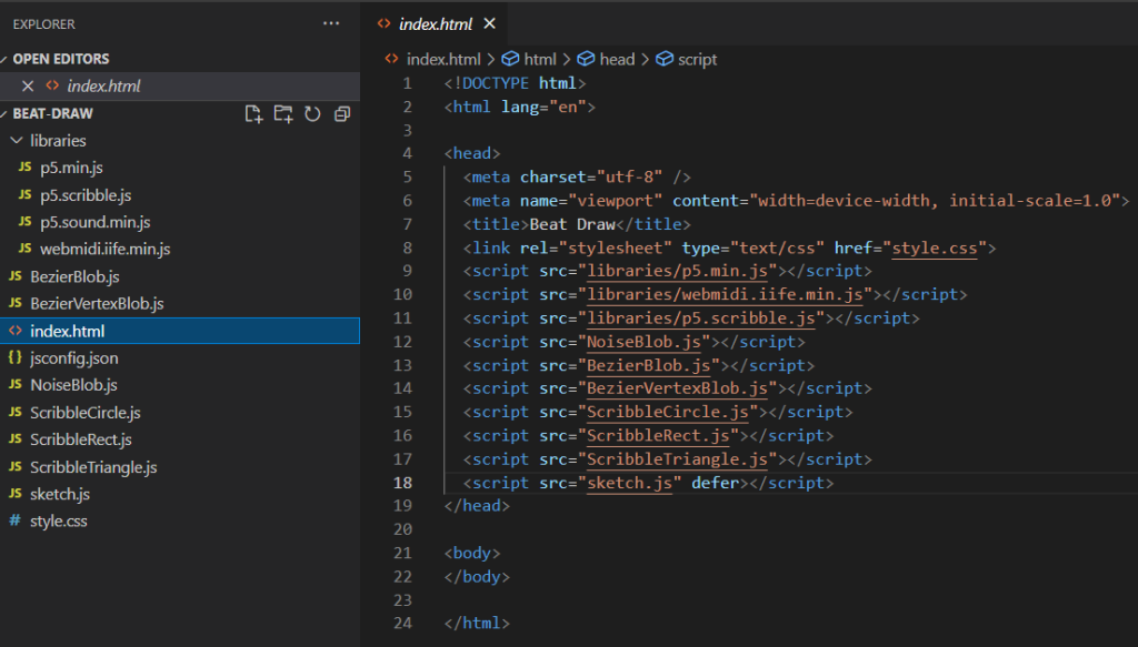
A sub-optimal directory structure, but good enough for a proof of concept.

WEBMIDI is well documented and easy to use – see the WEBMIDI Basics documentation

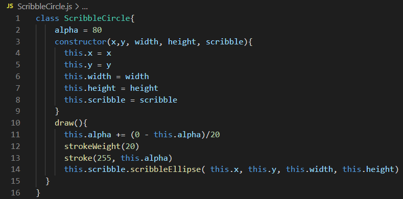
Following OOP principles, I created custom drawing classes for the specific shapes that I wanted to visualise, each with its own draw method making use of appropriate p5.scribble functions.

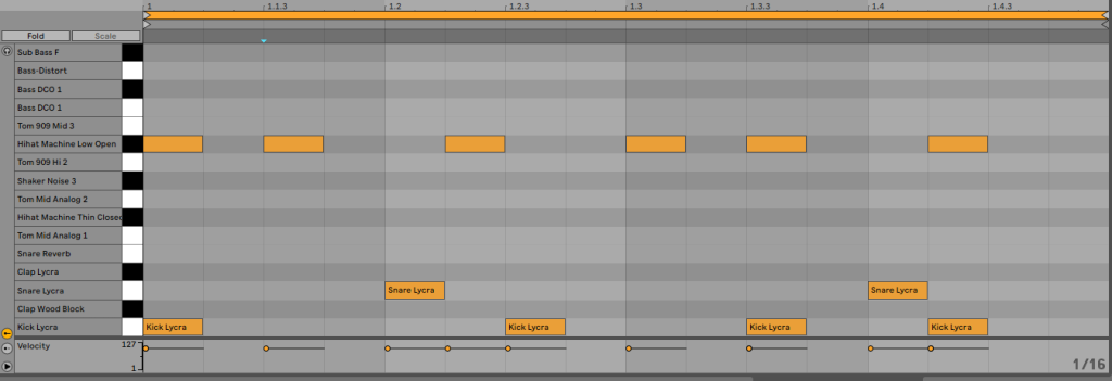
In Ableton, I created a simple drum pattern.

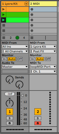
And sent the outgoing MIDI to a virtual port via Loop MIDI.

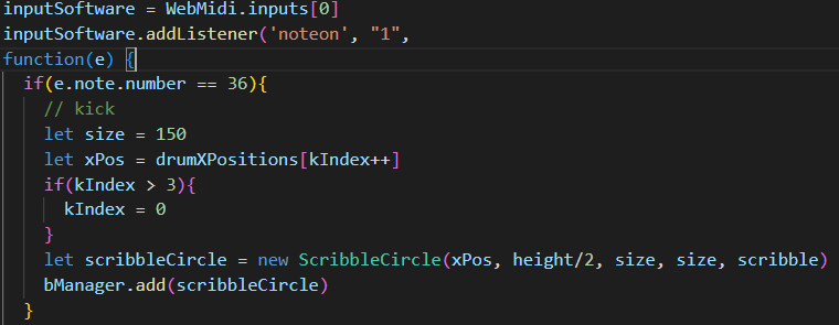
Back in p5, I added a listener for the incoming MIDI notes, instantiated the relevant drawing class for each one and passed it to the ‘BlobManager’, responsible for managing time-limited visibility for each note shape.

It all went smoothly and resulted in a fairly responsive, if very simple, audio visual proof of concept. Interestingly enough, when I ported the code to good old fashioned Processing, which uses Java rather than JavaScript, I saw no difference in perfomance or latency which makes me think that p5 is just as good a choice as Processing for creative experimentation.

If you are interested in more detail, here is the code, offered without liability, warranty or support! – https://github.com/jamiegledhill/P5-MIDI-notes

Research Presentation at Beyond 21

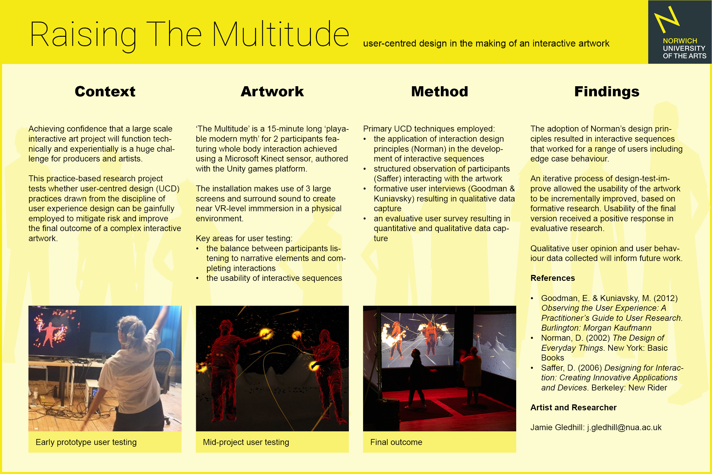
On October the 20th, 2021, I presented my preliminary research findings from The Multitude project at Beyond 21, ‘a conference where thinkers, makers, investors and researchers across the creative industries come together to explore the relationship between creative research and business innovation’. The event was physically held in Belfast with many elements presented online.

Here is the research poster that I submitted (select to enlarge):

And here is the presentation that I delivered:

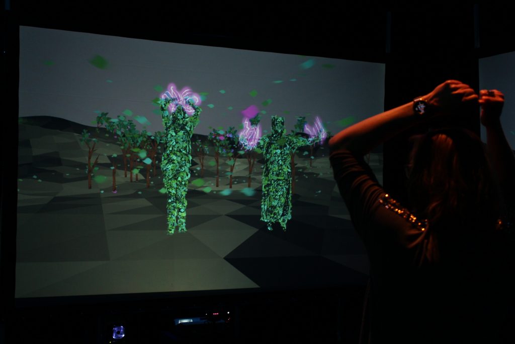
Initial testing of The Multitude

The Earth Elemental Scene

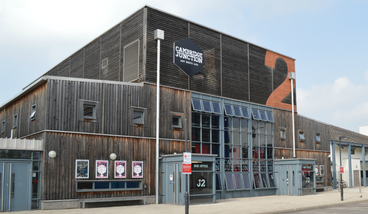
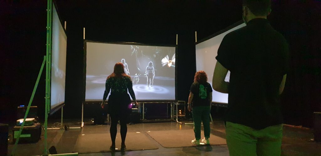
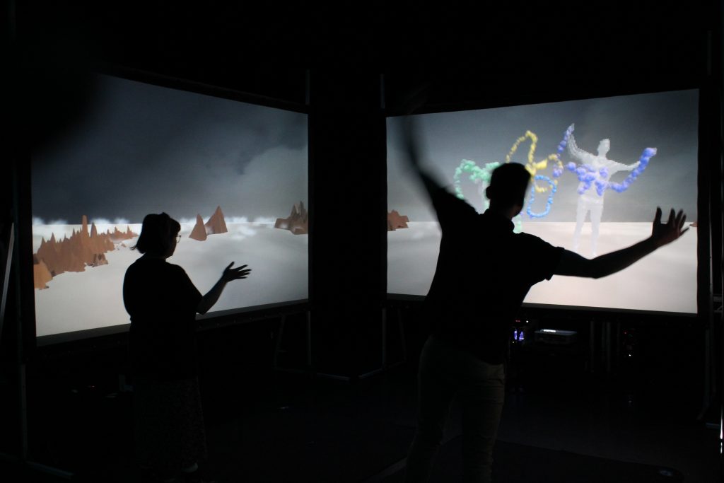
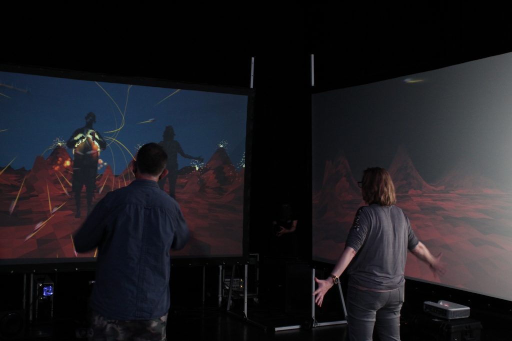
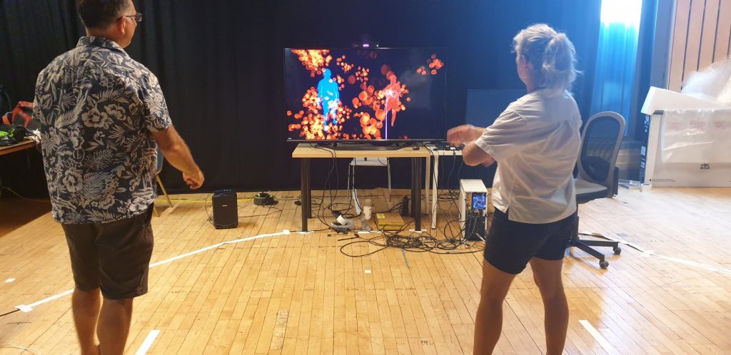
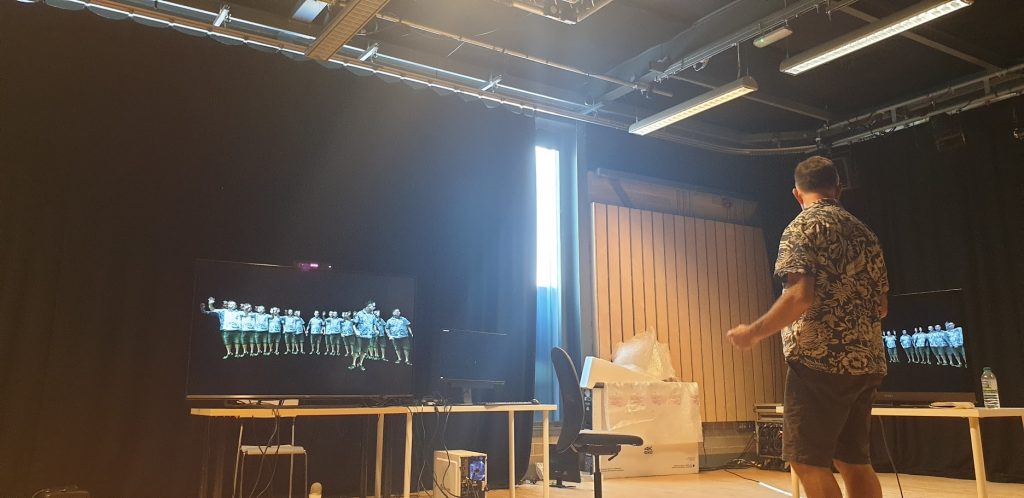
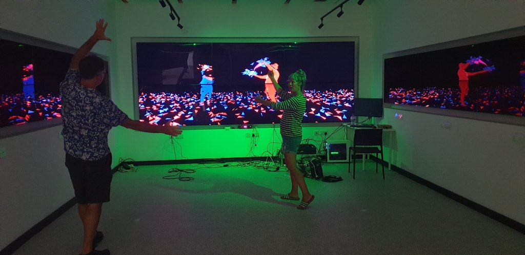
Myself and producers Collusion recently tested The Multitude at Cambridge Junction in preparation for exhibition in late June.

Cambridge Junction

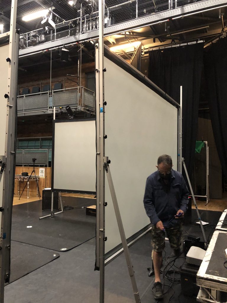
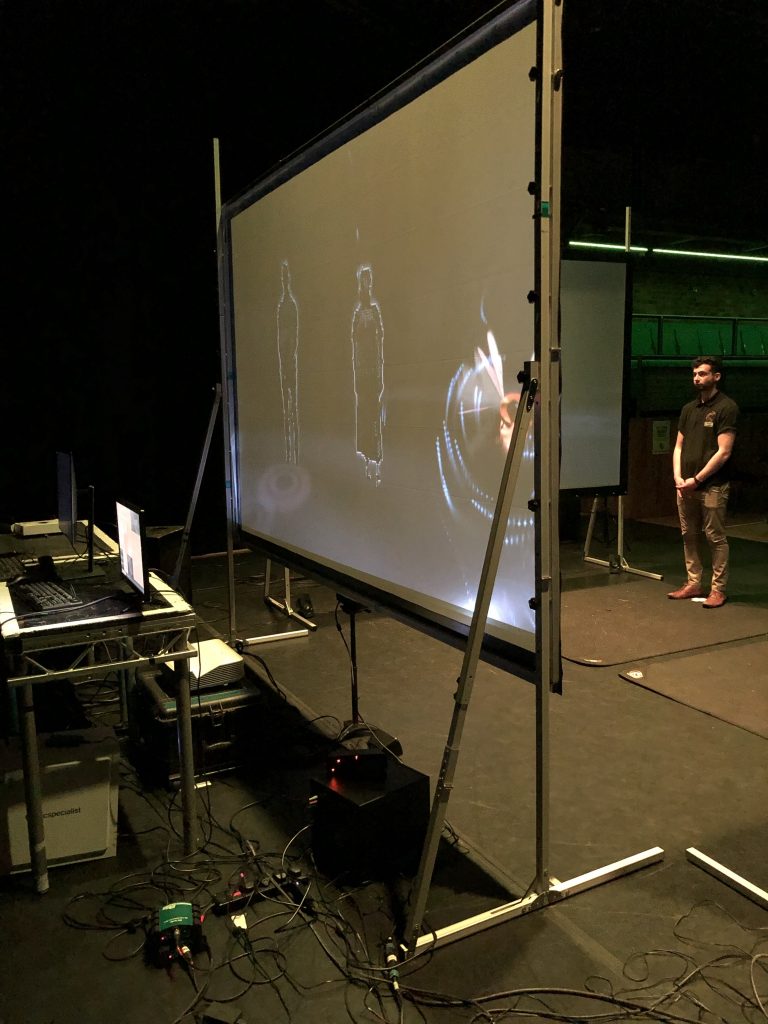
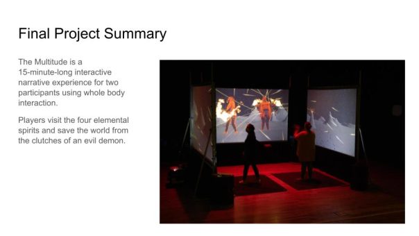
The installation requires a technically demanding set-up with multiple screens, speakers and programmable lights.

Routing leads
Checking positioning

We had a couple of technical glitches, as to be expected, but managed to do a few run throughs with testers in the late afternoon.

Our very first testers!
More testers
These two should know what they’re doing (artist and producer)

Generally, the installation worked well, but there are some tweaks to be made, as to be expected.

  • Some of the voices need to be re-scripted slightly and re-recorded
  • The sound design generally works although needs to be completed
  • The aesthetics need developing more for some scenes
  • Object placement needs to be improved to make the most out of the 3 screen set up
  • The core interactions require minor tweaking
  • Secondary interactions need to be added to give players something to do during the character introductions

There is actually quite a long list of minor tasks that need to be completed in the coming weeks, the above are just the highlights based on user feedback.

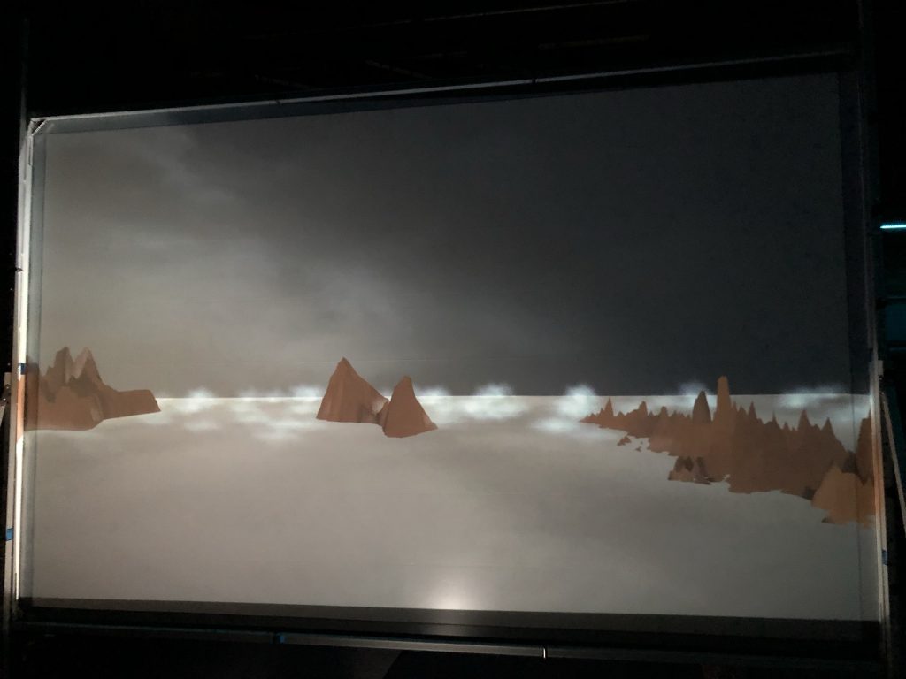
A side panel from the Air Elemental scene, one of the more visually resolved scenes.

Next steps: more development and testing!

Vision Mixers >> The Multitude

It’s been a while since I last posted about the Vision Mixers project, not least because of two intervening lockdowns in England and general Covid-19 uncertainty. Despite all this and as well as a very busy start to this academic year, I have been progressing steadily with project development.

The good news is that the project, now known as ‘The Multitude’, has just been awarded an Arts Council England grant to support further development, testing and exhibition. This is obviously a welcome development and means that the work will be shown in both Cambridge, Norwich and potentially another city over the coming months.

So, the general aim of the project is to create a ‘playable experience’ for two, lasting 15-20 minutes, where the players step through a series of interactive scenarios. The experience is  framed by a narrative construct that pits the players against ‘a demon’ that has recently cursed humanity, an act allegorical to the current pandemic crisis. Part of my interest in the narrative component comes from the idea of myth making, particularly in the face of danger and crisis. I was moved by the excellent Fairy-Tale Virus by Sabrina Orah Mark, published in the Paris Review, to think about how a modern fairy tale might be constructed to help mediate the current crisis.

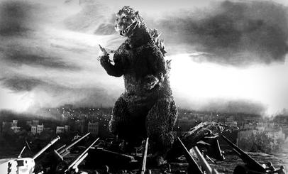
The 1954 film Godzilla is an example of a modern fairy tale (they’re often violent and feature monsters!) that was developed in the aftermath of the atomic destruction of Hiroshima and Nagasaki less than a decade earlier.

Godzilla in a scene from the film. © Toho Co. Ltd. ALL RIGHTS RESERVED

In The Multitude, the players cannot defeat the evil demon directly and must instead enlist the help of the four ‘elementals’: Earth, Water, Fire and Air. By fulfilling a task for each of the elementals, which forms the basis of player interaction for each scene, the players hope to awaken a sleeping army of ancient warriors known as ‘the multitude’, hence the name.

The research aims of the project have now been tweaked slightly. They are to investigate:

  • the nature of agency and how this is mediated through performative interaction
  • the mechanics of co-interaction
  • non-contact interaction design, especially in the context of the current Covid-19 crisis
  • the use of narrative to frame interactive experience

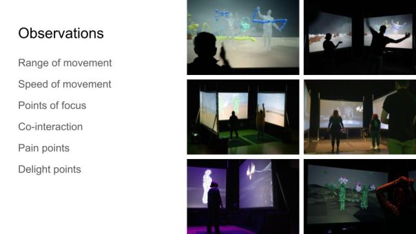
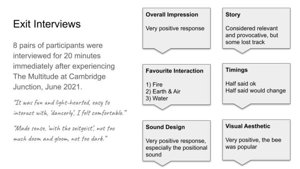
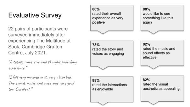
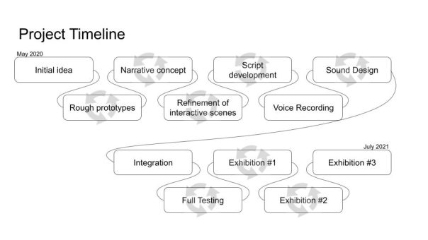
The research methodology is essentially to make the initial version of the work, conduct a round of early stage usability testing, iterate and then conduct more extensive audience testing at each exhibition opportunity. Usability testing will cover the nuts and bolts of interaction design and hopefully identify any significant problem areas. Audience testing will gauge sentiment and reaction, looking at for example, the success or otherwise of the narrative-interaction mix.

The project is quite sizeable already and will ultimately amount to many thousand lines of code written. A significant research output will be a technical review, but this will be framed within the context of interaction design rather than the discipline of computer programming. Coding is a means to an end in this case! For information purposes: the platform is Unity and interaction is achieved through the Microsoft Kinect for Windows.

This video gives an overview of the development work completed until November 2020.

Introducing Vision Mixers

I am pleased to be working with Cambridge-based art tech producers, Collusion, on a new interactive installation to be exhibited in Cambridge in late 2020. The venue will hopefully be Sook Cambridge.

Sook is an ‘adaptive retail space’ that can be easily customised to suit typical retail media requirements and booked by the hour. They have also experimented with hosting more artsy events. Sook at the Grafton Centre, Cambridge, features a number of grouped screens and addressible lighting. It’s the perfect environment for immersive audio-visual content, but naturally there are issues of interoperability to be addressed when installing a bespoke system that features realtime interaction.
The original project elevator pitch was “a social distancing compatible, two-person installation that makes use of whole-body interaction to explore inter-personal energies and connections within a 360° audio-visual environment”.

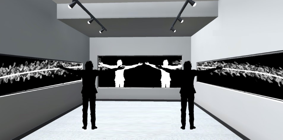
Early mock-up.

Since acceptance of the initial proposal, this project has already come a long way with writer, artist and multi-talented creative person Anna Brownsted joining to help develop narrative elements. Anna, myself plus Rachel Drury and Rich Hall from Collusion, all took part in a socially-distanced residency at Cambridge Junction in early August in order to get things moving.

There is a significant creative concept, currently in development, that will drive all narrative components and frame the interactions. I’ll write some more about this in due course, but for now will focus on documenting the residency and discussing key intentions for the project. I should add that this project is part of my ongoing research inquiry into gestural and embodied interaction within public-facing art. Non-technical areas of knowledge that I seek to develop are:

  • the nature of agency within public space and how this is mediated through performative interaction
  • the mechanics of co-interaction, especially the compete-callaborate axis
  • non-contact interaction design, especially in the context of the current Covid-19 crisis
  • the use of narrative to frame interactive experience

The project involves a relatively complex technical set-up with a single Kinect and host computer driving multiple screens and eventually surround audio and lighting, via DMX. The Kinect (v2) runs through Unity and allows pretty robust skeleton tracking, therefore providing the foundation for full-body interactive gestures. I will cover technical aspects more fully at a later date, but of course, expect there to be much learning in this area.

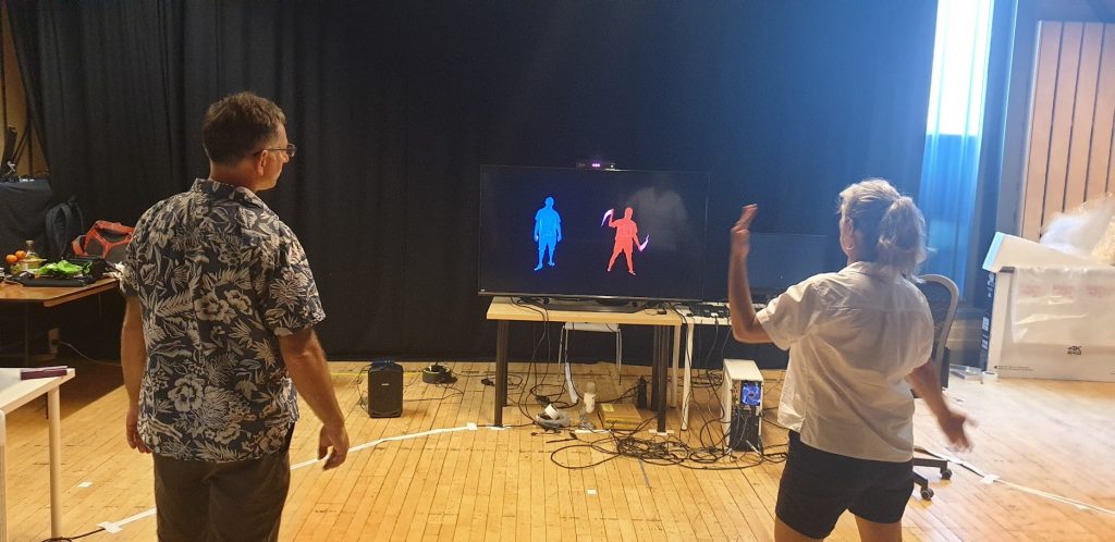
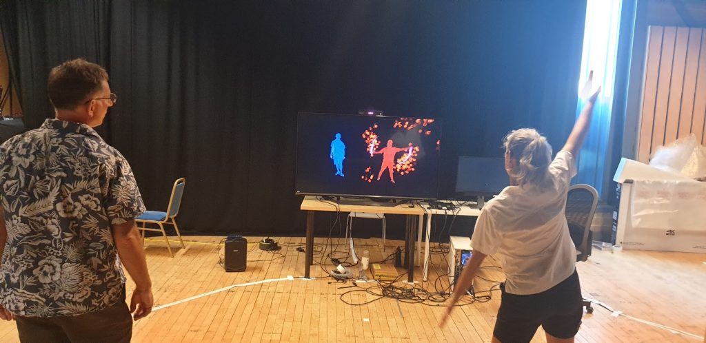
Here are a few photos and a video that illustrate the prototypes that were developed and tested during the residency.

Simple visualisation of users and movement of hands.
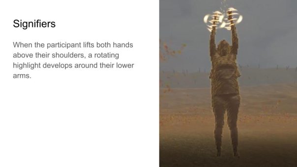
When the hands move faster, fireballs are produced!
Lots of fireballs produced by lots of movement.
Testing a user duplication routine.
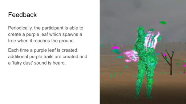
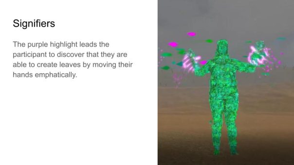
Picking up ‘leaves’, testing in Sook.

The video shows the fireball mechanic being tested at Sook.

The residency was massively informative in terms of validating the core interactions and kick-starting the project, especially by forming the team. It was a refreshing novelty to work in the same room as others after lockdown, even if we were santising left, right and centre! We also established some key technical parameters. It’s a really exciting, although slightly daunting project, especially as it runs in parallel with my full-time teaching responsibilities! More updates soon.

An Intro to UX for Artists

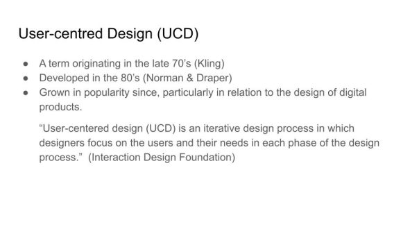
I’m currently involved in a collaborative art-tech research project between NUA and Collusion in support of emerging artists in the Norwich and Norfolk area. One of the topics I have been looking into is the way that UX practices and concepts may be used in the context of developing and delivering arts projects. This will come as no surprise, as I am a sometime artist myself as well as being a User Experience Design lecturer at Norwich University of the Arts.

Let’s establish a working definition of UX design as:

A multidisciplinary practice that sets out to create positive experience in the consumption of digital products and services by matching users’ needs, capabilities and motivations with corresponding functionality, content and reward.

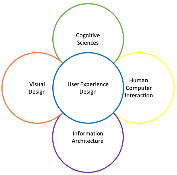
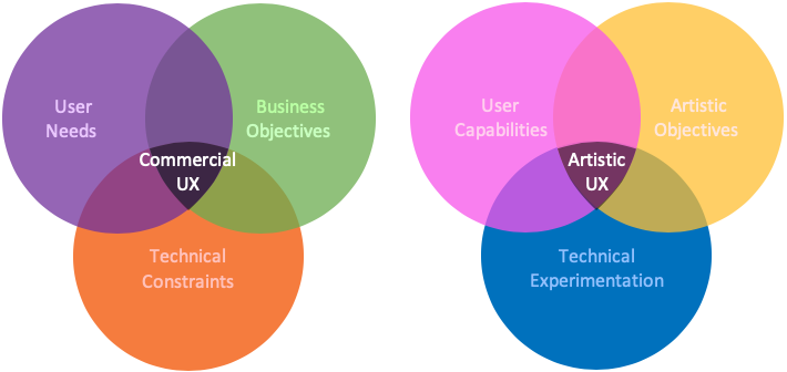
When considering the major areas of contributary practice that feed into UX design as it is commonly thought of, i.e. commercially oriented, it can be seen from the simplified diagram below that at least one or more of these disciplines is likely to be relevant to arts practice. The key questions here are whose art practice, what is the nature of that individual practice and therefore where are the natural synergies between that practice and the hybridised discipline that is UX Design?

The more digital the arts practice and the more it relies upon users, interfaces and content, the closer it comes to the natural territory of commercial UX Design.

Observation #1

Artists operating in the art-tech space would do well to consider where their practice can draw from UX Design and where it needs to be differentiated.

At the risk of stating the obvious:

The further away an arts practice is in nature from commercial UX Design, the more easily an artist can learn, borrow and steal from commercial UX Design.

The closer an arts practice is in nature to commercial UX Design, the harder an artist has to work to differentiate art works from commercial UX design-derived products and services.

Observation #2

Where well-designed user experience is intended to create delight in a commercial context, it can provoke a much wider range of emotional and intellectual responses in an artistic context.

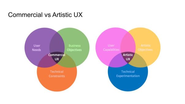
Let’s consider user experience design as a wholistic term that can be applied to the design of both commercial and artistic experiences that involve some form of interface.

Compare the potential driving forces behind UX for commercial purpose vs. those for artistic endeavour.

If anything, artistic user experience design has more chance of creating delight; it can address whimsical, comedic, bizarre or otherwise engaging non-commercial themes as it is not driven by business objectives. However, delight is not always the response that an artist seeks to provoke. Artistic user experience may reasonably provoke a whole range of responses from shock to shame, anxiety to antipathy etc.

Observation #3

Understand and embrace the research continuum.

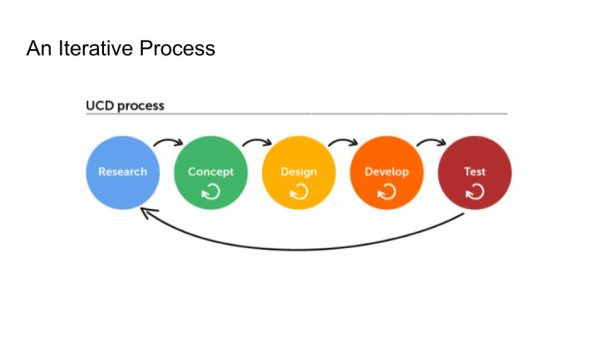
In the world of commercial UX, design is underpinned by substantive if not exhaustive research used to develop, evaluate and validate design strategy and implementation. UX research thinking identifies the shifting nature of research activity as a trajectory from formative to summative.

Research cannot be all things at all times, it has a role to play at a given point in a project cycle. Artists would do well to consider how and when they can use research in their projects. For example, thematic exploration at the formative stage of a project to user testing towards a final exhibition / installation.

Observation #4

The designer is not the user, the artist is not the audience.

‘The designer is not the user’ is a common maxim in UX design used to reiterate the importance of objective review and testing. Another well known supposition is that it’s only necessary to test with 5 users in order to identity design problems. This idea comes from an original article published by the grand-daddies of UX Design, the Nielsen-Norman Group.

The 5 user tests approach is based on research identifying that exponentially less new faults are disovered by a greater numbers of testers and therefore 5 testers alone will identify the most pertinent and immediate issues. In a sense, it is a form of cost benefit analysis; why pay for more testers when they will identify far fewer new faults than the first 5? There are many assumptions wrapped up in this assertion, not least that the scale of the project to be tested does not exceed the testing capabilities of 5 individuals. Although the original research is sometimes challenged, in my own opinion, it’s a sensible and achieveable approach to have at least 5 people test the core functionality of a project, be it commercial or artistic. The implication is to expect problems to be found and plan to resolve those problems before re-testing.

Artists woud do well to consider how, when and with how many people they can test their work

Observation #5

Respect the double diamond.

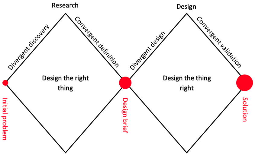
The double diamond is a construct popularised by the Design Council in the mid 2000’s. It has now evolved somewhat and has been adapted to suit a growing number of contexts. It is often used to underpin UX design workflow.

At its heart, quite literally, the double diamond situates a defined design brief. To the left of the design question, the first diamond represents a divergent process that begins with the investigation of an orginal question, problem or proposition.

In the UX design workflow, an initial process of divergent investigation is used to thoroughly explore user needs, behaviours, motivations etc as well as to examine a whole raft of other important contexts such as stakeholder requirements, technological, legal and financial considerations. Through the process of user, stakeholder and domain knowledge discovery, the UX designer can begin to formulate and validate hypotheses and propositions through a convergent process of definition leading towards a validated design brief. The first diamond is often summarised as ‘design the right thing’ and exists to mitigate the risk of creating unnessary and/or unwanted products.

The second diamond is often summarised as ‘designing things right’. It too begins with a divergent phase, but this time the primary activity is to develop a range of designs in reponse to the validated brief. At some stage, the most suitable design is selected and the final approach to an actual solution is characterised as a convergent process of design validation including, of course, user testing.

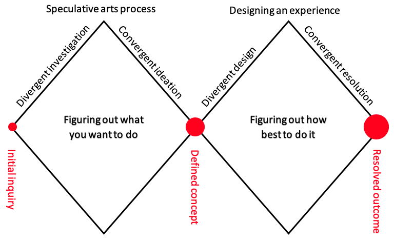
The double diamond approach is exceptionanly versatile and can easily be adapted to the process of making tech-art, as shown below.

In this case, speculative investigation replaces the user / domain knowledge discovery phase, although of course, the artist will discover their own domains of knowledge through the art research process. Convergent ideation replaces design definition with the end result looking very similar – a defined proposition at the heart of the double diamond. The second diamond is perhaps closer to the UX version shown previously; divergent and then convergent processes are used to transform the defined concept into a resolved outcome.

There are a number of other UX design concepts and practices that can easily be appropriated by artists. Check out the following resources to form your own.


Arrango, J., Morville, P. and Rosenfield, L. (2015) Information Architecture, 4th Edition. Sebastopol, CA: O’Reilly Media 

Cooper, A., Reimann, R., Cronin, D. & Noessel, C. (2014) About Face The Essentials of Interaction Design, 4th Edition. Indianapolis, Indiana: Wiley 

Morville, P. (2004) User Experience Design [website] http://semanticstudios.com/user_experience_design/

Schlatter, T. & Levinson, D. (2013) Visual Usability: Principles and Practices for Designing Digital Applications. Burlington, MA: Morgan Kaufmann. 

Being Human 2019 – Evaluation

The session began with an insightful discussion about museum display item descriptions in general and whether they are read. One opinion was that they are good to have on-hand but often may not actually be read in full. However, the group seemed to agree that it is generally better to have more detail than less.

This reminds me of the classic inverted pyramid (‘Inverted pyramid (journalism)’, 2019) writing technique where the reader delves into as much detail as they desire, assuming that the reach of the pyramid matches the reader’s expectation. Following this structure, the body of writing answers all the key questions in brief within the opening sentence(s) before moving on to incidental/secondary detail that may only be of interest to a particular audience.

The workshop proper began by asking participants to examine key texts and then devise keywords to act as labels for these. In the first pass completed as a group, participants came up with quite different keywords for the same text, perhaps unsurprisingly. A keyword in this context almost certainly denotes personal insight or individual significance to a greater extent than being constructed as a signpost for someone else. To construct signposting keywords for general usage, there would need to be a more systematic approach.

Boudica I

The story of the Queen of the Iceni has fascinated every age from Roman times to the modern day.

She was very tall and severe. Her gaze was penetrating and her voice was harsh. She grew long red hair that fell to her hips and wore a large golden torc and a vast patterned cloak with a thick plaid fastened over it.

Dio Cassio

A Roman writer

An example of a key text.

Participants continued to work through texts individually and associate keywords with chosen samples. They then chose one particular keyword and spent 20 mins developing a ‘creative outcome’ using paper, pre-printed typographic elements, pens, patterned paper etc. Some thoughtful and attractive versions of keywords were produced. This gave rise to a conversation about the typography of a keyword as an ‘affordance’ (Norman, 2013), although the actual term affordance wasn’t used directly, i.e. as a signifier of the nature of the respective content. This is an interesting area of discussion, as originally I had conceived the project as being a kind of test of textual interaction, and to see how much interest could be developed by just working with text as a user interface concept. The text-only constraint was conceived before I started working with the museum as a collaborative partner and was based on the premise of exploring texts that exist in their own right, not relating to a physical object as the museum texts generally are.

In any case, text must be rendered using a character set which effectively establishes ‘typographic voice’, a widely known graphic design principle. So, choice of font will always have some bearing on perceptions of keyword affordance and of course, some fonts are highly embellished with ornamentation and/or feature iconography to the point of being at least as pictorial as they are typographic.

There was some discussion about the information hierarchy relating to museum displays and one suggestion was that it would be great to move from one item to another ‘like using the internet’ which I interpret as the idea of there being an organic-like information structure behind a given keyword. This structure might be more shallow and wide than deep and constrained. This idea chimes with my original concept of being able to traverse an information hierarchy by using a keyword alone. But this scenario requires information design of far greater scope than the current prototype.

Although the workshop participants were quite interested in the LEAP controller, it seemed that this was more of a secondary attraction to the discussion and practical investigation of keywords and associated texts. I did manage to get a number of passers-by to try out the prototype and altogether I gleaned some useful insights. One woman managed to really get the hang of the interaction scheme. Initially the controller didn’t pick up her hands and I suggested that she either roll her sleeves up or take off her coat, which she did, showing good commitment! (I have noticed in previous situations that even slightly overhanging sleeves can affect the LEAP controller’s ability to recognise hand position.) It took her a couple of minutes, but then she was navigating, selecting and closing content quite fluidly. She commented that it was a bit like ‘learning to drive’ and that once you got the hang of it, ‘the muscle memory’ took over. She was the success story of the session and her words resonated with me.

Other participants struggled to lesser or greater extent to master control. A younger child (my son) had a go, but also struggled somewhat and this may be to do with the fact that smaller hands do not seem to register well with the LEAP.

In general, the collaborating partners agreed the Being Human 2019 project was a positive experience that helped to develop a new creative partnership and conduct preliminary investigation into the design of gestural interactive experience with textual elements of the museum collection. Although only one of the two planned workshops actually took place, valuable insights were gained:
Consideration of place –  the nature of a workshop is affected by the physical space it takes place in, particularly if this an art gallery.

The relationship between text and object – where text is derived from an object, especially one that is close by, text accompanied by visual reference to the object makes more sense. Conversely, it makes less sense when the visual reference is missing.

The power of preliminary discussion – there was profound and informative  discussion about experience design and female gaze within the museum at the beginning of the workshop.

The challenge of establishing meaningful workshop outcomes –  the hybrid format of the workshop, physical and virtual, worked to a certain extent but could be developed to guide participants towards achieving a more tangible outcome(s) potentially over a longer period of time.

The inherent challenges of gestural interaction  – some participants found the interaction tricky. It may be that gestural interaction is more suited to a gamified experience where there is a more distinct and fun ‘pay-off’ as a consequence of ‘mastering the moves’. In general, it probably needs to be made simpler for a public-facing experience.

The likely benefit of a longer collaborative cycle – with new technology, the first point of contact is effectively an introduction. Subsequent sessions would be beneficial for participants to have more meaningful input into experience design, including potentially testing work in progress with members of the public.
References

‘Inverted pyramid (journalism)’ (2019) Wikipedia. Available at https://en.wikipedia.org/wiki/Inverted_pyramid_(journalism) (accessed 24/11/19)

Norman, Don (2013) The Design of Everyday Things. Revised and expanded. Basic Books.