The session began with an insightful discussion about museum display item descriptions in general and whether they are read. One opinion was that they are good to have on-hand but often may not actually be read in full. However, the group seemed to agree that it is generally better to have more detail than less.
This reminds me of the classic inverted pyramid (‘Inverted pyramid (journalism)’, 2019) writing technique where the reader delves into as much detail as they desire, assuming that the reach of the pyramid matches the reader’s expectation. Following this structure, the body of writing answers all the key questions in brief within the opening sentence(s) before moving on to incidental/secondary detail that may only be of interest to a particular audience.
The workshop proper began by asking participants to examine key texts and then devise keywords to act as labels for these. In the first pass completed as a group, participants came up with quite different keywords for the same text, perhaps unsurprisingly. A keyword in this context almost certainly denotes personal insight or individual significance to a greater extent than being constructed as a signpost for someone else. To construct signposting keywords for general usage, there would need to be a more systematic approach.
Boudica I
The story of the Queen of the Iceni has fascinated every age from Roman times to the modern day.
She was very tall and severe. Her gaze was penetrating and her voice was harsh. She grew long red hair that fell to her hips and wore a large golden torc and a vast patterned cloak with a thick plaid fastened over it.
Dio Cassio
A Roman writer
An example of a key text.
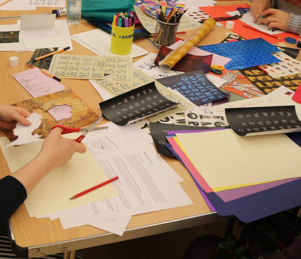
Participants continued to work through texts individually and associate keywords with chosen samples. They then chose one particular keyword and spent 20 mins developing a ‘creative outcome’ using paper, pre-printed typographic elements, pens, patterned paper etc. Some thoughtful and attractive versions of keywords were produced. This gave rise to a conversation about the typography of a keyword as an ‘affordance’ (Norman, 2013), although the actual term affordance wasn’t used directly, i.e. as a signifier of the nature of the respective content. This is an interesting area of discussion, as originally I had conceived the project as being a kind of test of textual interaction, and to see how much interest could be developed by just working with text as a user interface concept. The text-only constraint was conceived before I started working with the museum as a collaborative partner and was based on the premise of exploring texts that exist in their own right, not relating to a physical object as the museum texts generally are.
In any case, text must be rendered using a character set which effectively establishes ‘typographic voice’, a widely known graphic design principle. So, choice of font will always have some bearing on perceptions of keyword affordance and of course, some fonts are highly embellished with ornamentation and/or feature iconography to the point of being at least as pictorial as they are typographic.
There was some discussion about the information hierarchy relating to museum displays and one suggestion was that it would be great to move from one item to another ‘like using the internet’ which I interpret as the idea of there being an organic-like information structure behind a given keyword. This structure might be more shallow and wide than deep and constrained. This idea chimes with my original concept of being able to traverse an information hierarchy by using a keyword alone. But this scenario requires information design of far greater scope than the current prototype.
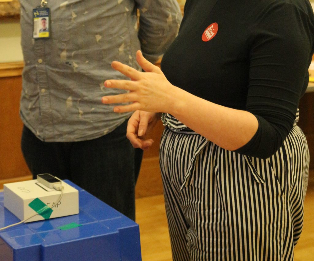
Although the workshop participants were quite interested in the LEAP controller, it seemed that this was more of a secondary attraction to the discussion and practical investigation of keywords and associated texts. I did manage to get a number of passers-by to try out the prototype and altogether I gleaned some useful insights. One woman managed to really get the hang of the interaction scheme. Initially the controller didn’t pick up her hands and I suggested that she either roll her sleeves up or take off her coat, which she did, showing good commitment! (I have noticed in previous situations that even slightly overhanging sleeves can affect the LEAP controller’s ability to recognise hand position.) It took her a couple of minutes, but then she was navigating, selecting and closing content quite fluidly. She commented that it was a bit like ‘learning to drive’ and that once you got the hang of it, ‘the muscle memory’ took over. She was the success story of the session and her words resonated with me.
Other participants struggled to lesser or greater extent to master control. A younger child (my son) had a go, but also struggled somewhat and this may be to do with the fact that smaller hands do not seem to register well with the LEAP.

In general, the collaborating partners agreed the Being Human 2019 project was a positive experience that helped to develop a new creative partnership and conduct preliminary investigation into the design of gestural interactive experience with textual elements of the museum collection. Although only one of the two planned workshops actually took place, valuable insights were gained:
Consideration of place – the nature of a workshop is affected by the physical space it takes place in, particularly if this an art gallery.
The relationship between text and object – where text is derived from an object, especially one that is close by, text accompanied by visual reference to the object makes more sense. Conversely, it makes less sense when the visual reference is missing.
The power of preliminary discussion – there was profound and informative discussion about experience design and female gaze within the museum at the beginning of the workshop.
The challenge of establishing meaningful workshop outcomes – the hybrid format of the workshop, physical and virtual, worked to a certain extent but could be developed to guide participants towards achieving a more tangible outcome(s) potentially over a longer period of time.
The inherent challenges of gestural interaction – some participants found the interaction tricky. It may be that gestural interaction is more suited to a gamified experience where there is a more distinct and fun ‘pay-off’ as a consequence of ‘mastering the moves’. In general, it probably needs to be made simpler for a public-facing experience.
The likely benefit of a longer collaborative cycle – with new technology, the first point of contact is effectively an introduction. Subsequent sessions would be beneficial for participants to have more meaningful input into experience design, including potentially testing work in progress with members of the public.
References
‘Inverted pyramid (journalism)’ (2019) Wikipedia. Available at https://en.wikipedia.org/wiki/Inverted_pyramid_(journalism) (accessed 24/11/19)
Norman, Don (2013) The Design of Everyday Things. Revised and expanded. Basic Books.
